Behind the Scenes: tiansamxia.com
May 2021
Overview
This document describes the thinking process and design decisions behind this website, tiansamxia.com. In doing so, it also demonstrates my approach to writing a UX design doc.
See also: Design Ethos.
Context and scope
tiansamxia.com is my personal website where I showcase my work and share projects, photos, and writings. Previously, I had created and hosted the site with Squarespace. In this version, I decided to design and code it by myself.
Using services like Squarespace allowed me to focus on the content — the most important, no doubt — but required giving up fine control over its presentation. I became a passenger rather than the driver. I also didn’t have full ownership over my site: it was “mine” as long as I paid the rent; once stopped, I’d need to move all my stuff out if I didn’t want to lose them.
Crafting the site myself is an opportunity to bring everything back to the essentials: no CMS, database, or JavaScript frameworks; just plain, straightforward HTML & CSS written by a human, readable by another. I can also use this chance to catch up on the latest web technology and practice my HTML and CSS skills.
Goals
-
Back to the essentials: text, images, video, etc., all marked up in HTML and styled with global CSS — zero JavaScript.
-
Quiet & understated: the design should serve the content and not attract attention itself. “As little design as possible.”
-
Typography-first: text as an interface — use typographic rather than graphic treatments to define layout & structure.
-
Follow the web’s grain: a web experience true to its building materials; no scroll-hijacking or over-the-top animations.
-
Fast & responsive: “to add speed, add lightness” — a petite website is easier to implement and performs better.
-
Low maintenance: minimize dependency on third-party tools and services. Choose open-source over proprietary.
-
Have some fun: I tend to make things look too serious, so this is a reminder for myself.
Non-goals
-
Make an impression. It’s not a goal to create a novel or eccentric site that stands out. Let the work speak for itself.
-
Fully responsive design. It shouldn’t break on a phone, but responsive grid and images can come later.
-
Legacy browser support. If you’re reading this on the latest stable version of Safari, Firefox, or Chrome, you will be fine.
-
Light & dark themes, keyboard shortcuts, etc. These are nice-to-haves that may come in the future, but not now.
Detailed design
In the sections below, I’ll cover some design decisions and the rationale behind them. Although it looks tidy and linear here, the actual process was far more convoluted and interwoven: changing the primary typeface affects the body text size, the text size affects the grid, et cetera, et cetera. See alternatives considered section for select detours and deadends.
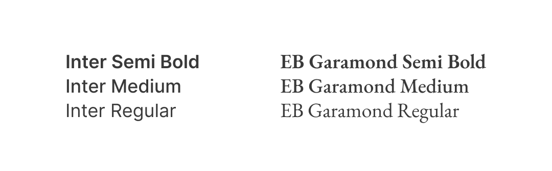
Typeface: Inter & EB Garamond
The fewer fonts a website uses, the faster it loads (goal: “fast & responsive”). Therefore I decided to use only one typeface for almost everything: body text, titles, headings, captions, etc.
Bonus challenge: the chosen typeface should look similar to system fallbacks — San Francisco, Roboto, Segoe UI, etc. — so even if the webfont doesn’t load correctly, the site still looks alright (goal: “low maintenance”).
I chose Rasmus Andersson’s Inter because it is:
- Highly legible, even at small sizes (body & caption text);
- Available as a variable font (wide range of design variants);
- Designed for UI (where its name came from);
- Free & open-source (“low maintenance”).
Besides Inter, I also used EB Garamond, an open-source, digital replication of the classic serif face designed by 16th-century typographer Claude Garamont. It complements the main sans-serif face and shows up sparingly on the site.
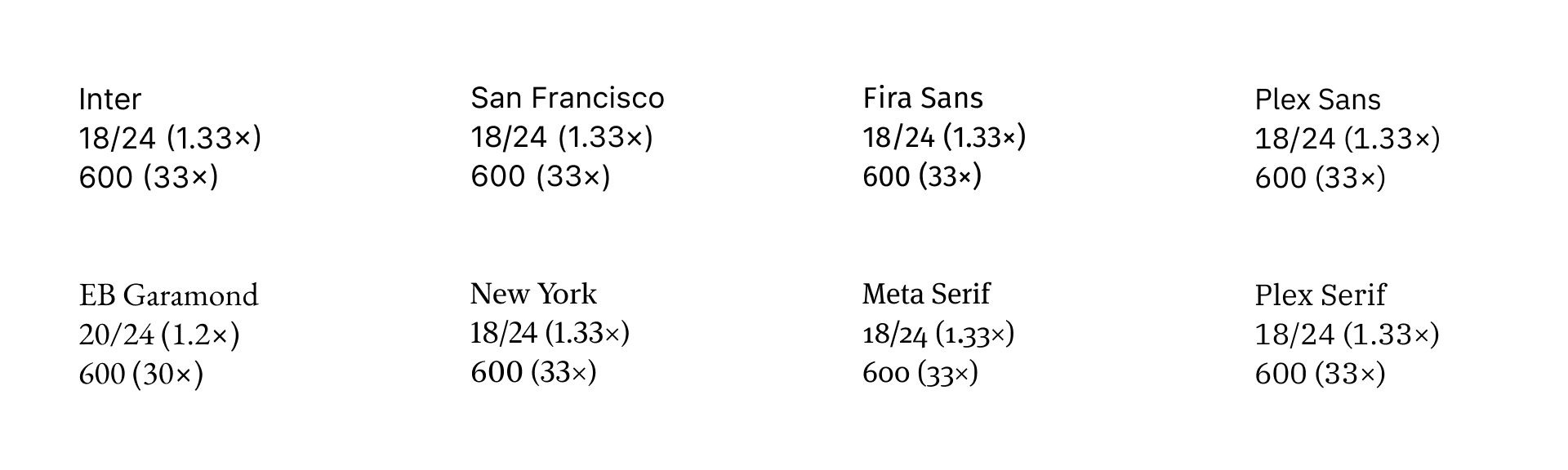
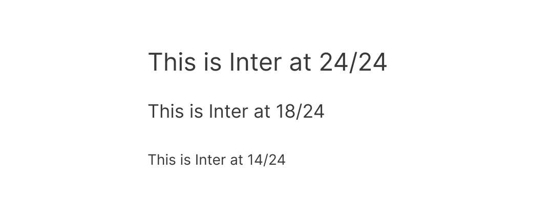
Type scale: 14 • 18 • 24
Next, I needed to determine the body text size and use it as the basis for a type scale. To do that, I first needed to set some boundaries:
- Base unit: 8 px, or 0.5 rem (“follow the web’s grain”);
- Line height: 1, 1.5, or 2 rem;
- Line length: 65–75 characters per line (“typography-first”);
- Narrowest viewport supported: 320 px.
After extensive experiments, I set the body text size at 18 px. Line height is 24 px (1.5 rem), which is also the unit for spacing: 2-line is 48 px, 4-line is 96 px, and so on.
Aside: Contrary to conventional belief, there isn’t a strong need to adjust text size based on the device; manufacturers have already done that work for us. For instance, iPhone’s screen has a pixel density about 20% higher than iPad’s, so texts on iPhone will be about 20% smaller — if compared side by side. However, because we typically hold our phones closer, their optical sizes will be similar. The viewing distance compensated for the difference in absolute size.
Using the line height as a guide, I settled on one smaller and one larger text size: 14 px for captions and footnotes; 24 px for titles and big headings. These three sizes form the type scale.
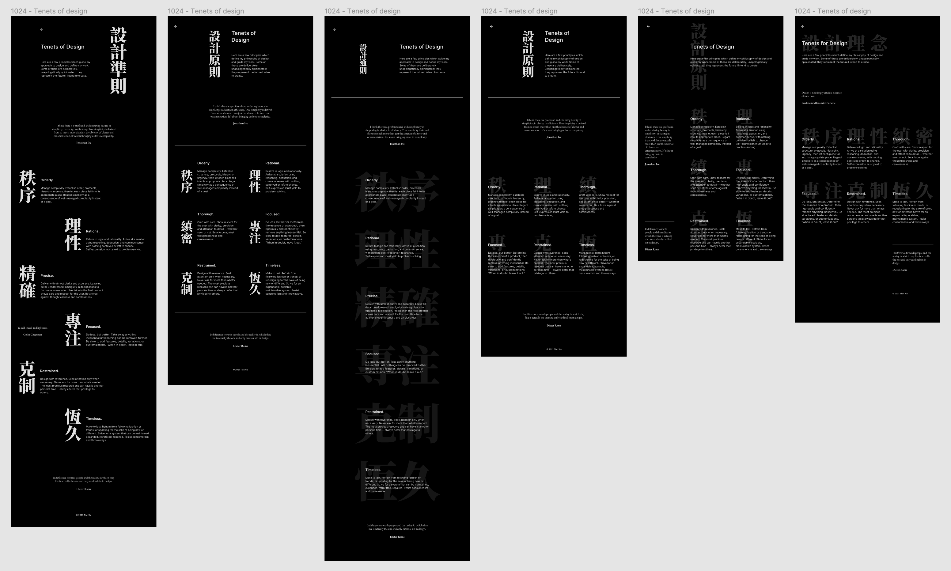
Hierarchy: one change at a time
With the type scale defined, I moved on to creating a structure within the text. There are five levels of hierarchy in my content:
- Title
- Heading
- Subheading
- Body
- Caption/footnote/etc.
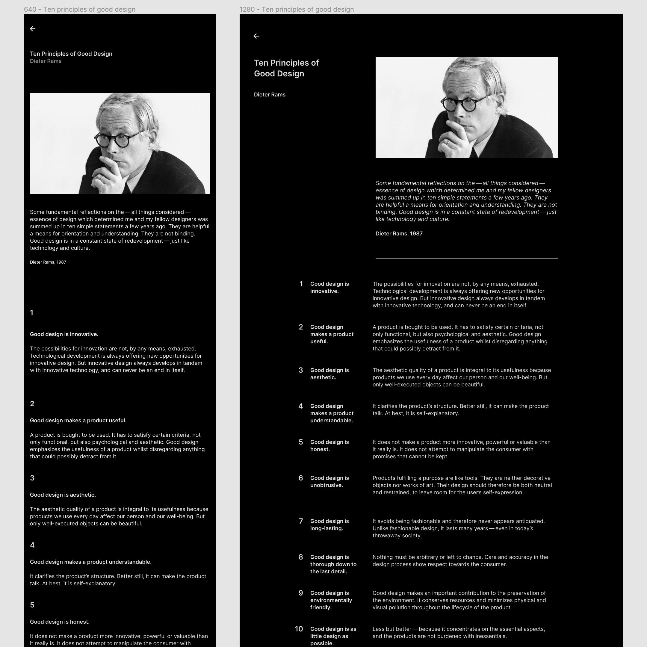
One way to visually communicate this structure is to increase text size as the level moves up: subheadings bigger than body texts, headings bigger than subheadings, and so forth. That’s also the default behavior of headings in HTML. The problem is, text size often inflates so quickly that we end up with comically huge titles.
But size isn’t the only tool for creating hierarchy. Here’s a list of typographic tools at our disposal, adapted from Frank Chimero:
- White space
- Size
- Weight
- Style (italic, small caps, or a different typeface altogether)
- Color (this is borderline between typographic and graphic)
My approach: use one tool at a time, and use the smallest increment necessary (goal: “quiet & understated”).
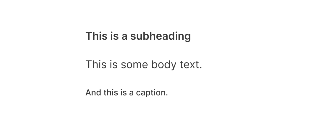
I started with the obvious: subheadings are the same size as body text, only in a heavier weight (semi-bold):
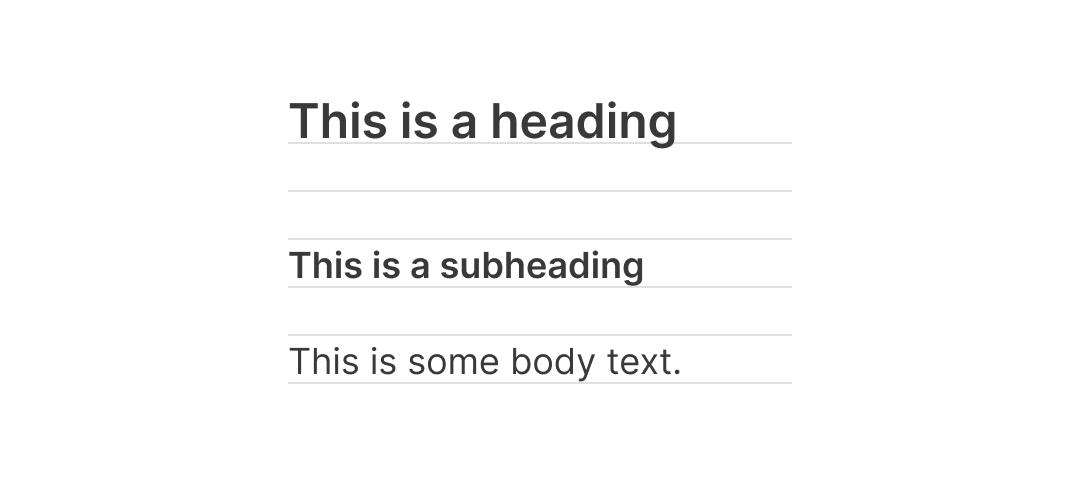
Next, headings are the same weight as subheadings, but in a larger size (I also added an extra line of white space to make them more prominent):
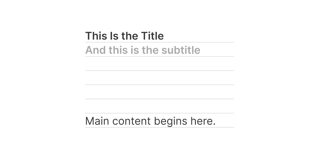
Finally, we have the title. Since there’s only one title per page, and it’s already at the top, it’ll be too much to increase size or weight further. Instead, I kept the title the same size & weight as subheadings and used white space to do the trick (if the page has a subtitle, it’ll be in a lighter color):
Of course, the exact sizing and spacing can vary based on the page: the hierarchy should serve the content, not the other way around (“quiet & understated”).
Color: monochromatic
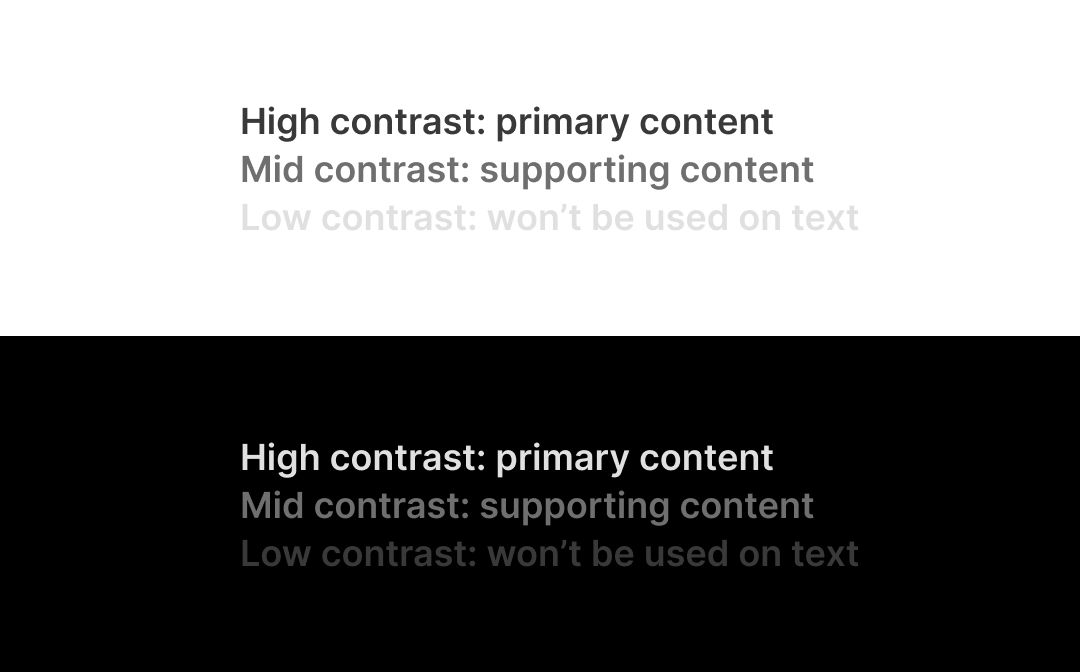
Color is perhaps the easiest decision: greyscale only. I used three shades of grey for high (primary content), medium (supporting content), and low contrast against the background. The default color theme is dark.
Why dark? Here’s the logic:
- To simplify implementation, I’ll begin with just one theme;
- Light theme is too bright in the dark; dark theme works in either light or dark;
- Bonus: a pure black background can save energy on OLED displays, in addition to protecting the eyes.
Grid: it’s complicated (but doesn’t have to be)
I’ll confess: I have an obsession with grid systems. I lose myself in tweaking the numbers for the gutters, columns, and margins like solving a sudoku puzzle. I win if they’re all integers divisible by 8.
So after sinking hundreds of hours designing “the ultimate grid system,” my conclusion is: grid for the web is hard. I know.
Multi-column grids, which are fantastic for print, don’t work on the web. A web page is bottomless, so the content will keep flowing until it ends — not where the page ends. You could force a multi-column design, sure, but it breaks as soon as the viewport gets too narrow — because a web page is also not opinionated about its width. It can go from 320 px to 2560 px and beyond: that’s a difference between 1 and 8 columns.
What do we do, then? Well, we can go the easy way or the hard way.
The hard way is: change the layout every time it wants to break. So if you started with an 8-column design, it will change to 6, 4, 2, and eventually a single column. Lots of details to think about and lots of work to get them right, of course.
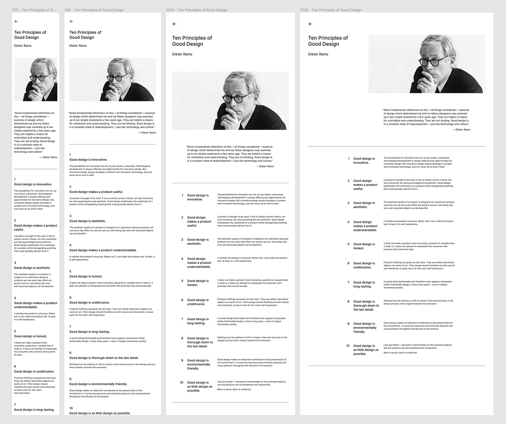
Or you can choose the easy way: start with just one column (a.k.a. mobile-first). You could still have 2-up or 3-up layouts when there’s enough room, but it “just works” as the viewport gets wider. The only thing to worry about is text measure (unless you want your site to look like Wikipedia).
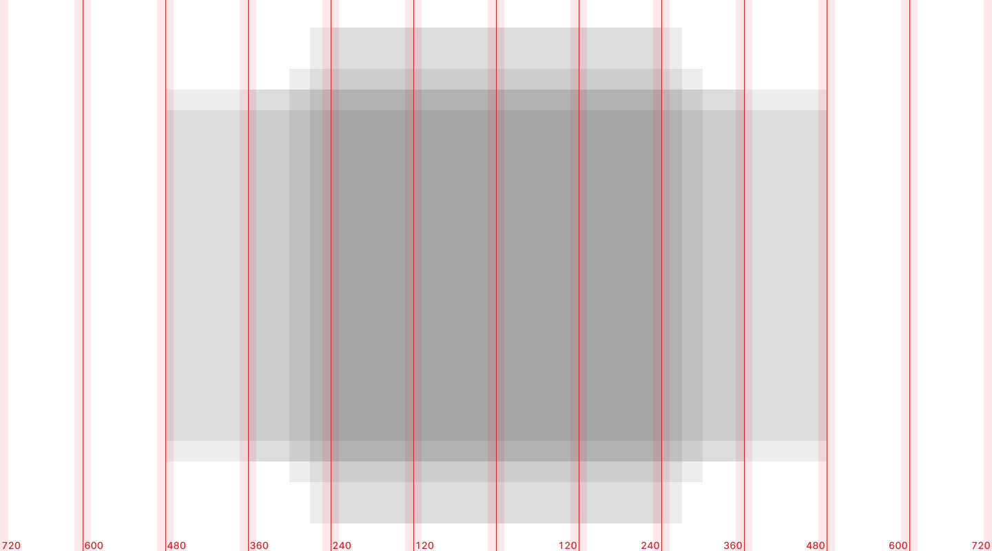
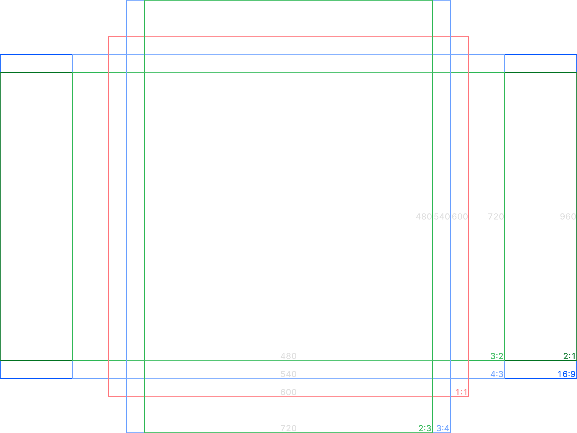
For my website, I chose the second approach. Content starts with a single column; text blocks have a max-width of 600 px (roughly 75 characters); media can go beyond that depending on its aspect ratio:
- 480×720 px (2:3)
- 540×720 px (3:4)
- 600×600 px (1:1)
- 720×540 px (4:3)
- 720×480 px (3:2)
- 960×540 px (16:9)
- 960×480 px (2:1)
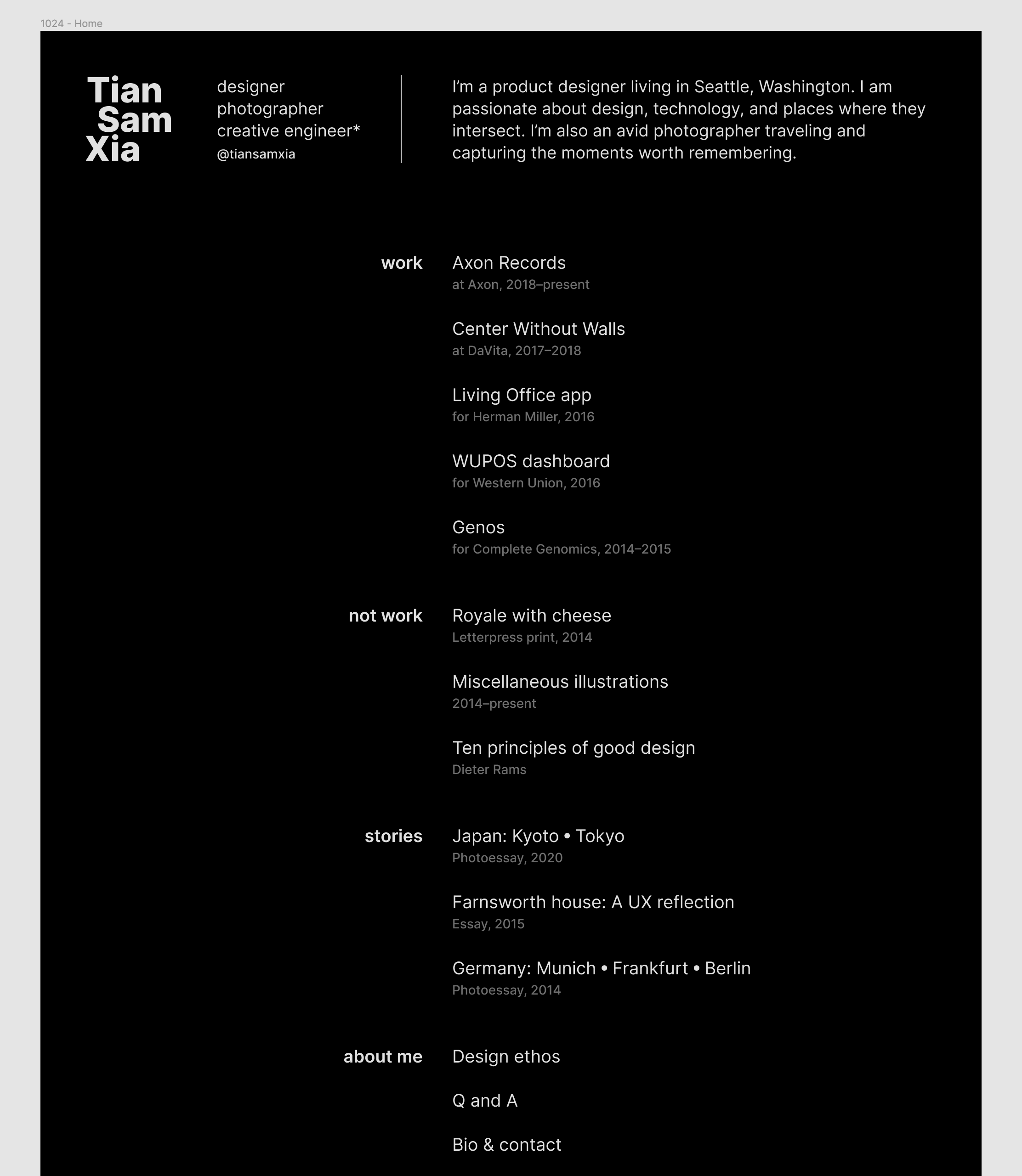
To add variety and prevent pages from looking like they’re from the early 2000s, I also used an asymmetrical 2-column layout on the home page and some content pages (including this one). Thanks to CSS Grid, they gracefully revert to single-column when the viewport is narrow.
Navigation: always just one step away from home
Older versions of my website used to have three levels: home, collections (“work,” “photography,” etc.), and content pages. In this version, I reduced it down to two: home and content.
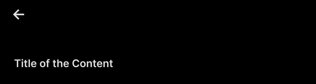
Something magical happens to the navigation when there are only two levels: you don’t need any. Anywhere on the site, you are only one step away from home. Gone are the landing pages for each collection, a persistent header with links, and a mini sitemap in the footer. The new “header” is just a back button.
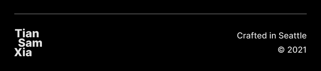
The new home page also returns to its roots: an index of the entire site (goal: “back to the essentials”). The footer, relieved from its sitemap-bearing duty, now contains only one link — to go home, so you don’t have to scroll back to the top again.
Besides indexing content, the home page also absorbs the former “about” and “contact” pages. Now it’s one less click/tap to find a blurb about me or ways to connect.
Logotype & favicon: understated fun
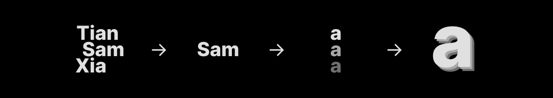
Perhaps the only “personality” I added to my otherwise neutral and sterile website is the logotype and favicon design (goal: “have some fun”).
The logotype idea came after numerous attempts at creating a personal logo from my name. “What if I stacked them?” — hmm, interesting. “How about all lowercase?” — nope, that didn’t work. “What if I aligned them by the shared letter a?” — now we’re getting somewhere.
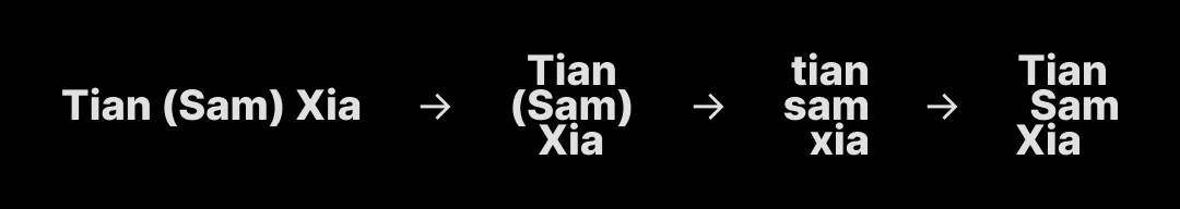
The favicon was a classic example of “limitation galvanizes imagination”: at 16×16 px size, no details in the logotype were discernable. So I kept reducing the mark until there was only one letter left: a.
Alternatives considered