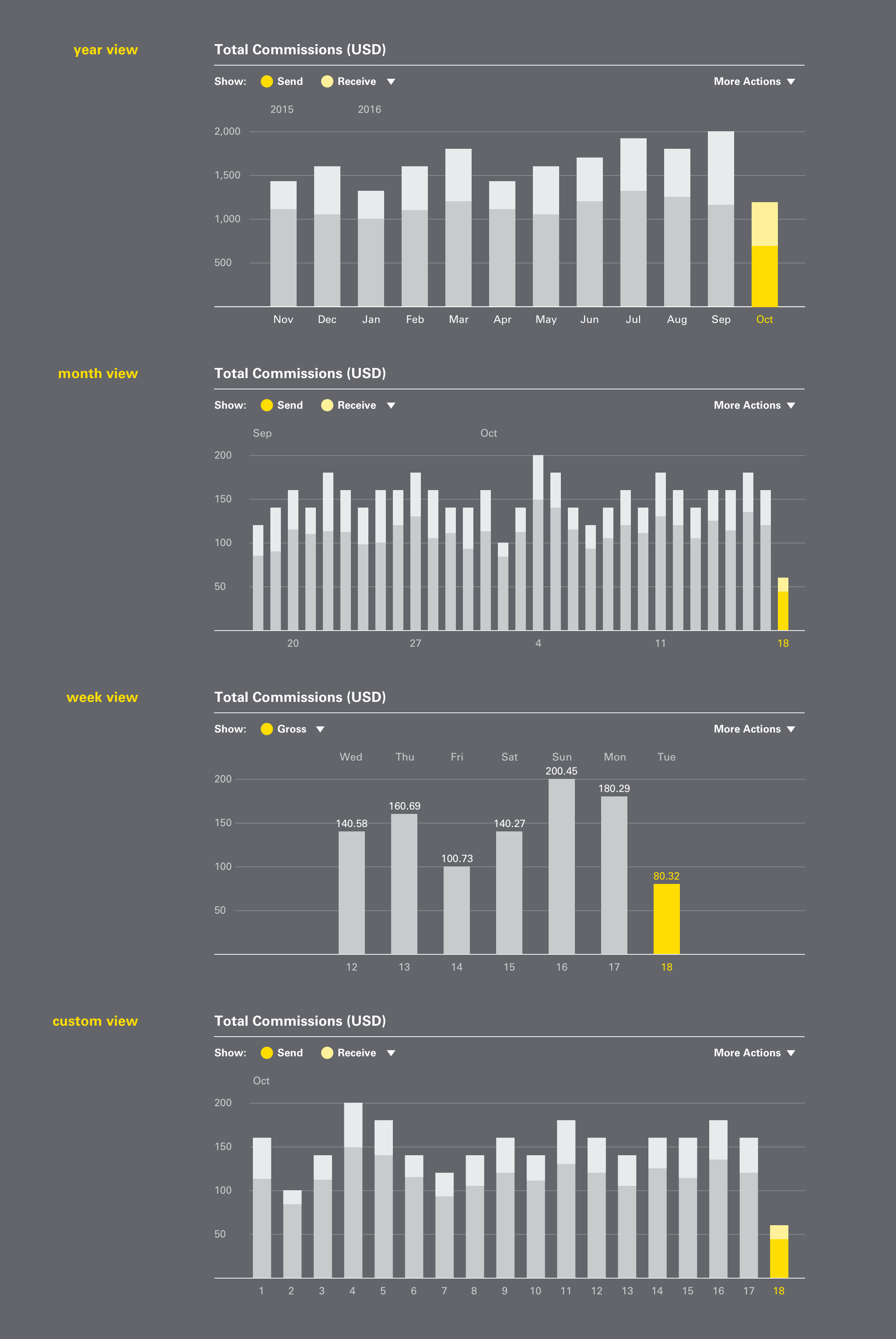
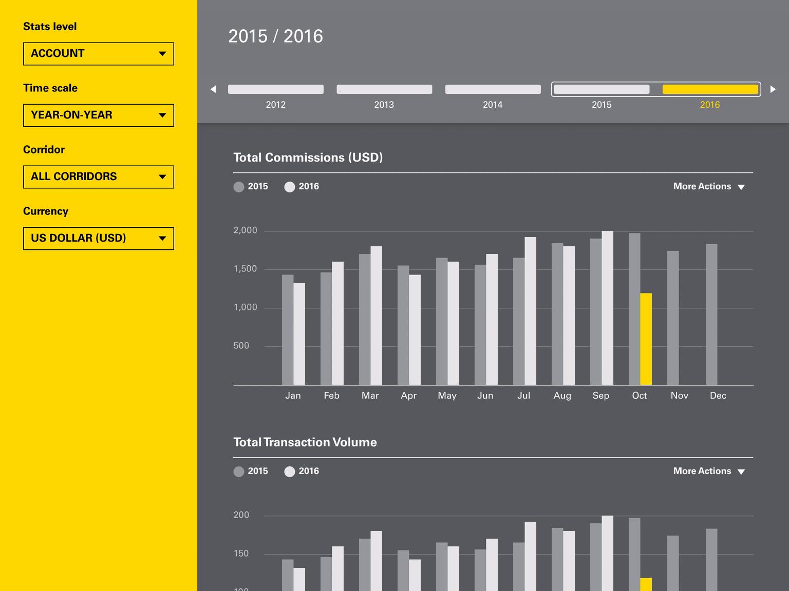
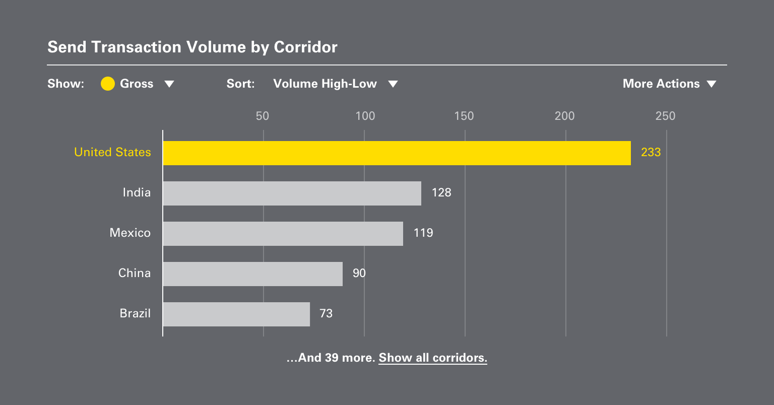
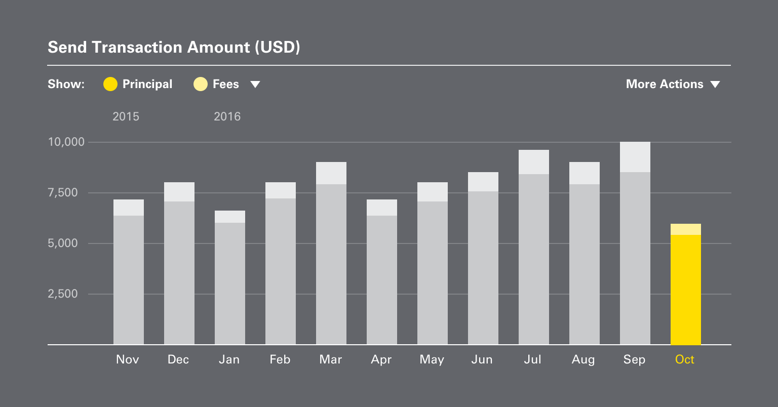
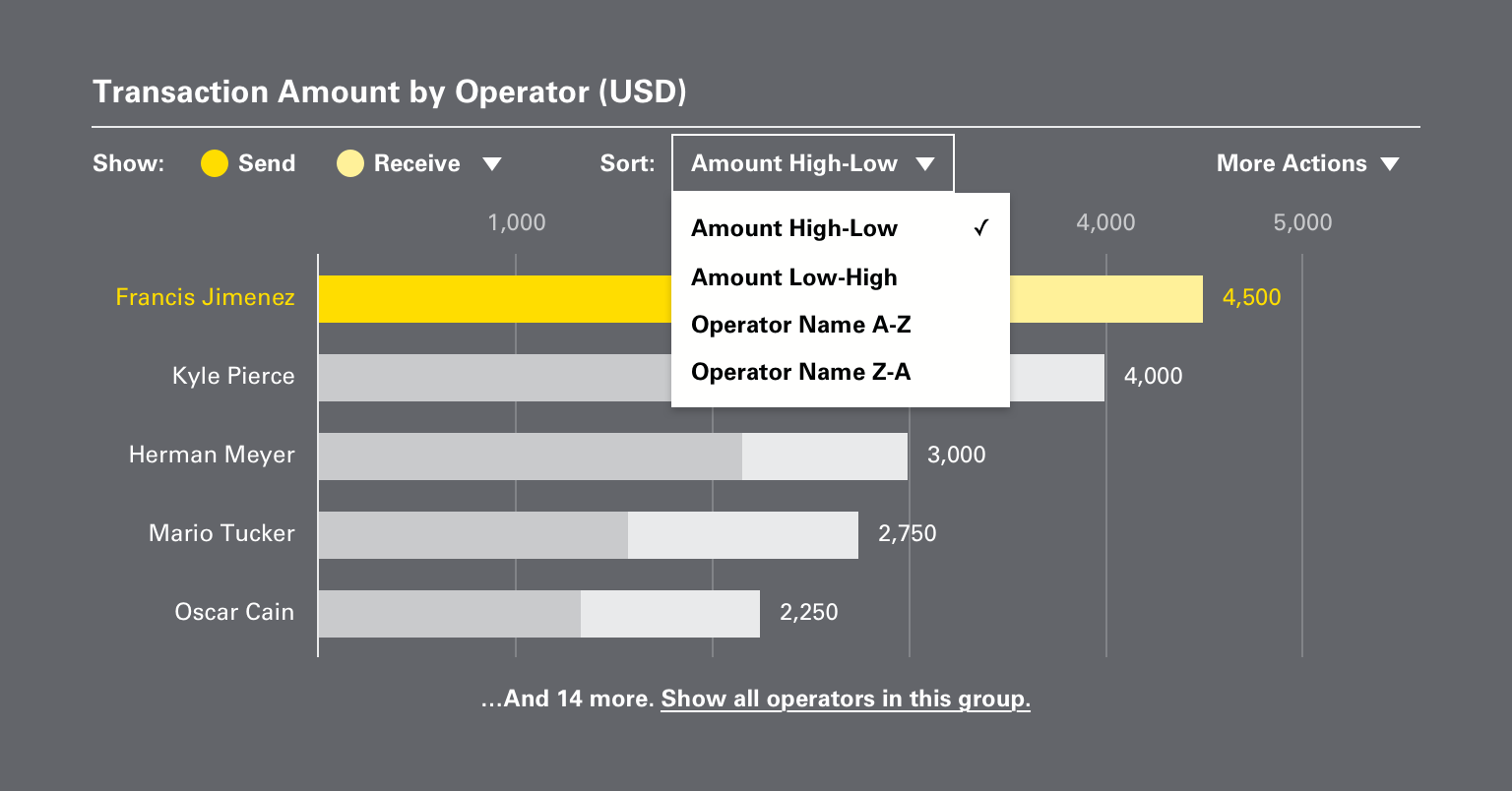
WUPOS Dashboard
Western Union agents use a dashboard on the point-of-sale system to monitor their transaction volume, amount, and commissions. They want to view the data by week, month, and year and compare it over time.
The existing dashboard has limited features and poor usability, leading agents to rely on printouts instead. We were asked by the client to redesign the dashboard.
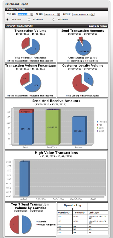
The status quo
-
Manual date range only — no shortcuts for frequently used ranges such as week, month, or year
-
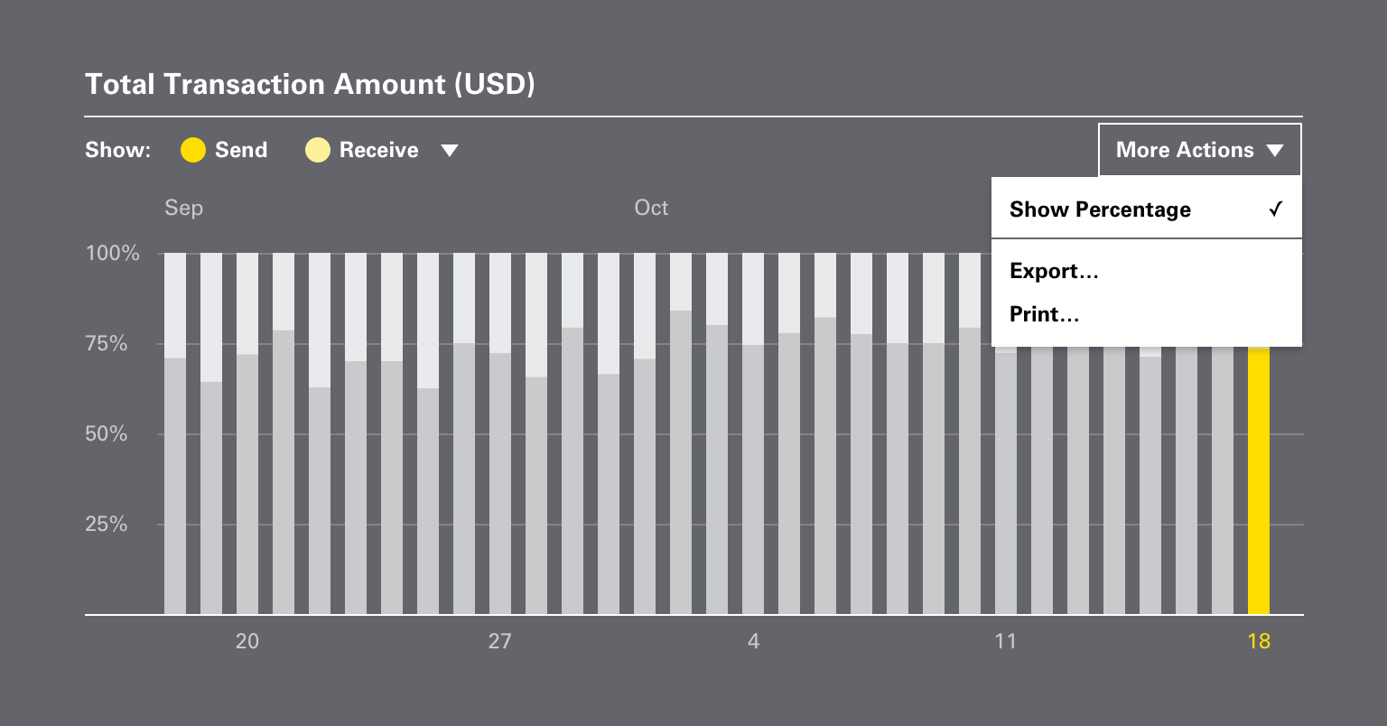
Limited customizability for the charts and graphs
-
Lacking a way to compare data over time
-
UI isn’t touch-friendly (the POS system runs on a touchscreen device)
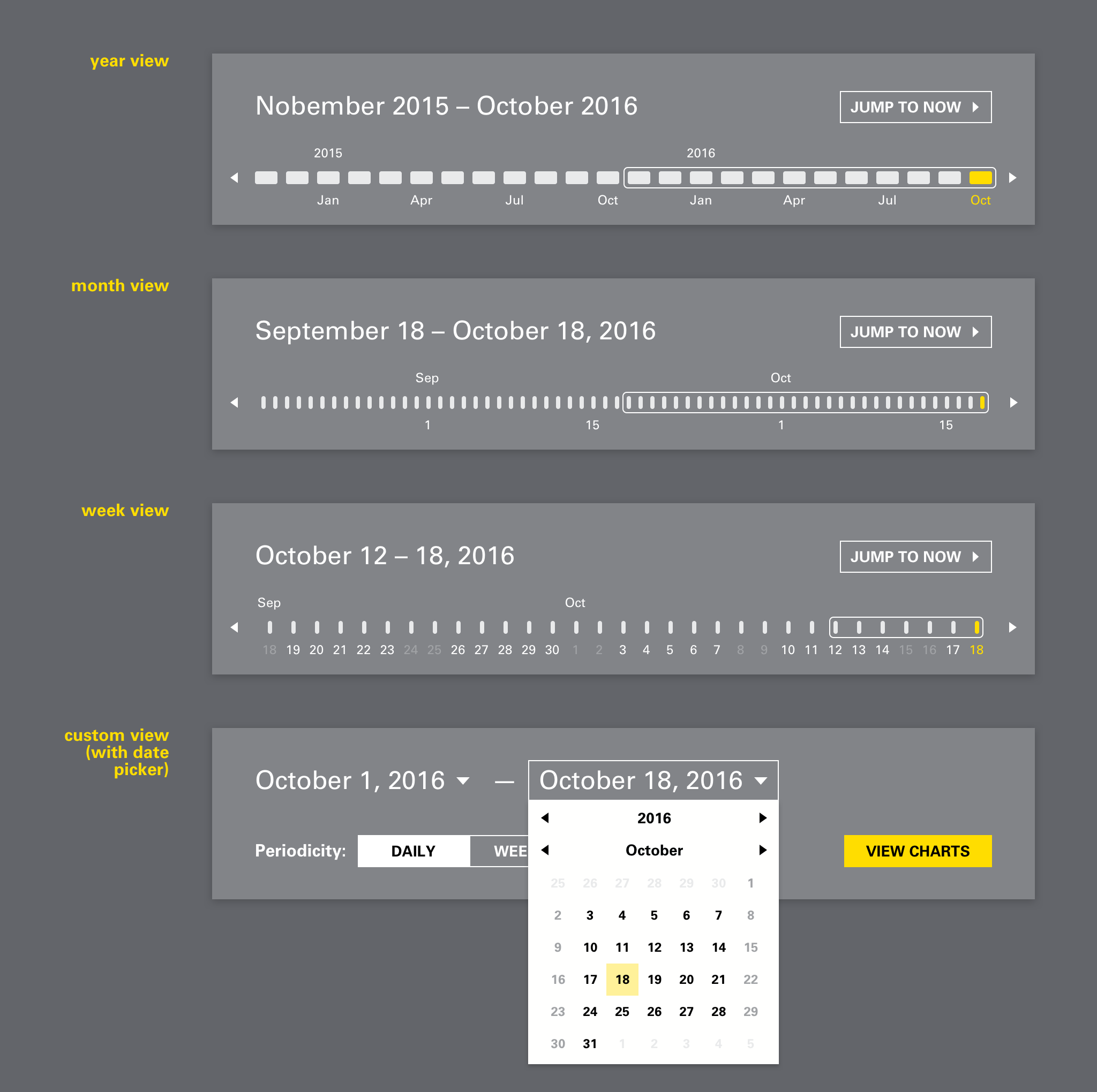
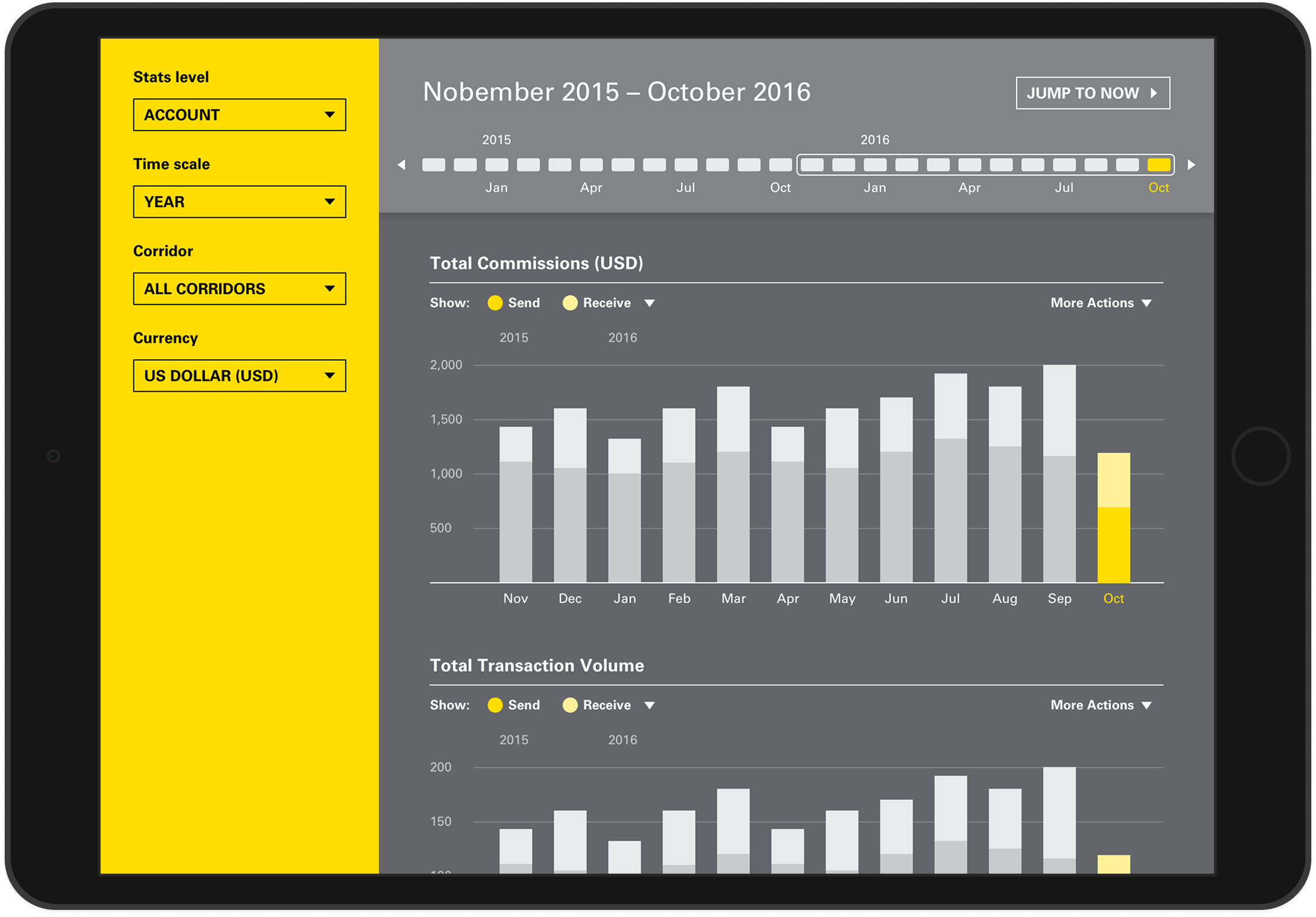
The redesign
-
Easily toggle between week, month, year, and year-on-year views (custom date range is still an option)
-
Flexible ways to filter, sort, and compare data
-
Modern, touch-friendly UI
-
Typography and color consistent with the Western Union brand
Project artifacts