Living Office App

Herman Miller’s Living Office is a smart furniture platform for the workplace. This app is a software companion to a suite of internet-connected hardware, starting with the sit-to-stand desk.

  • Client

    Herman Miller

  • Industry

    Office & home furnishings

  • Involvement

    2016 (6 months)

  • Design team

    2 people


For those in a hurry…

Experiences I gained:

  • Working closely with and presenting designs regularly to a world-class client;

  • Designing for mobile and following iOS design guidelines and best practices;

  • Collaborating with another consultancy (Fuseproject) to create a harmonious software and hardware experience for the user;

  • Conducting user research, synthesizing insights, and generating concepts;

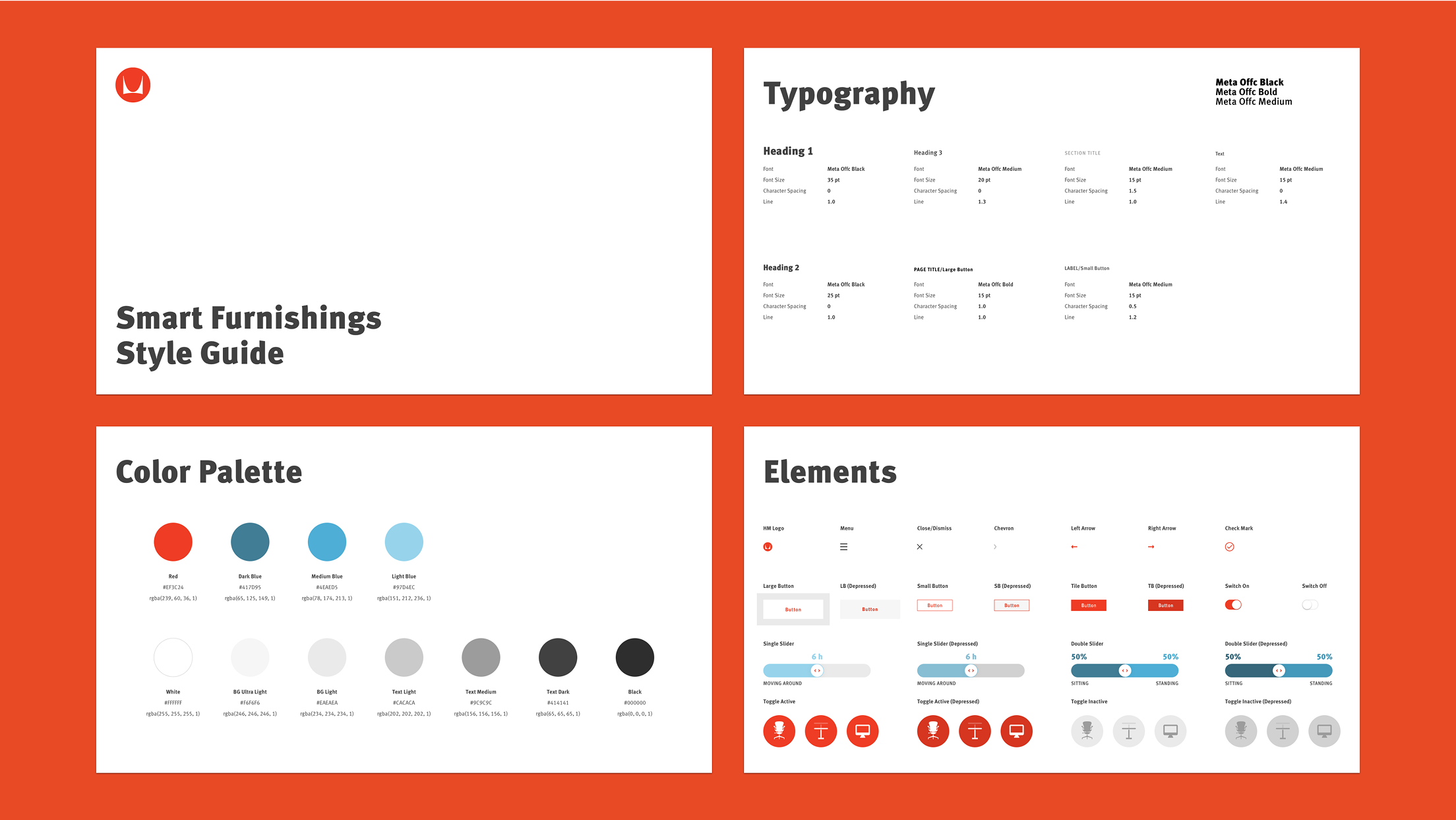
  • Adhering to established brand guidelines for typography, color, and interactive elements;

  • Delivering and iterating designs with quick turnarounds.

Lessons I learned:

  • Buying a sit-to-stand desk doesn’t make you healthy — prolonged standing is also harmful. Staying active and switching between sitting and standing throughout the day is the key.

  • Clients usually don’t have a solution — that’s why they hired you — but they often have the resources you need to get answers. All you have to do is find and ask the right questions.

  • When the client says there’s no budget for usability testing, do it anyway. They’ll likely thank you later.

  • Don’t indulge the little novelist in you and write long UI copy that no one cares to read (except maybe yourself).


Objectives

  1. Create an onboarding experience to help the user set up their task chair and sit-to-stand desk.

  2. Assess the user’s current activity level during a working day, then recommend a wellness goal for them based on the assessment.

  3. Encourage the user to change postures throughout the day and stay on top of their goal.

Constraints

  1. Limited time to deliver the initial working prototype (for product announcement at a convention).

  2. High ambiguity around what wellness goals to recommend and how to arrive at a recommendation.

  3. No budget for usability testing (we did guerrilla tests anyway).


App experience

The Living Office app allows you to save your sitting and standing height preferences for your smart desk. It also helps you set a wellness goal and encourages you to move between the two postures throughout the day.

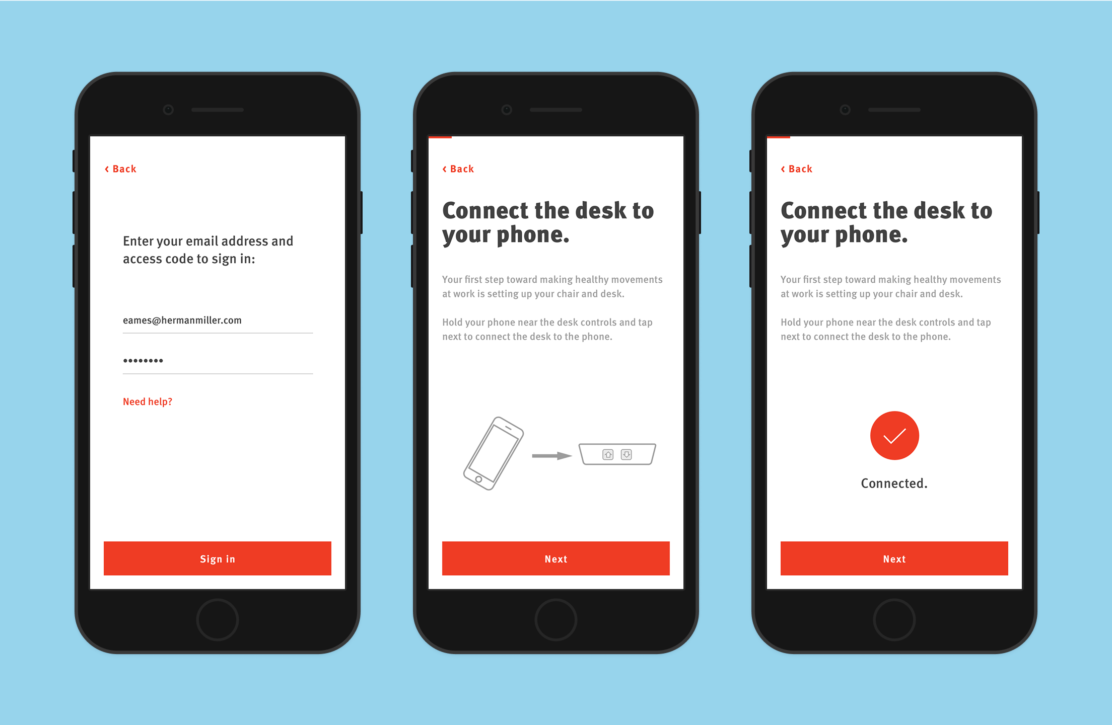
Connect. Your phone connects to the smart desk via Bluetooth Low Energy. It allows the app to sync your preferences with the desk.

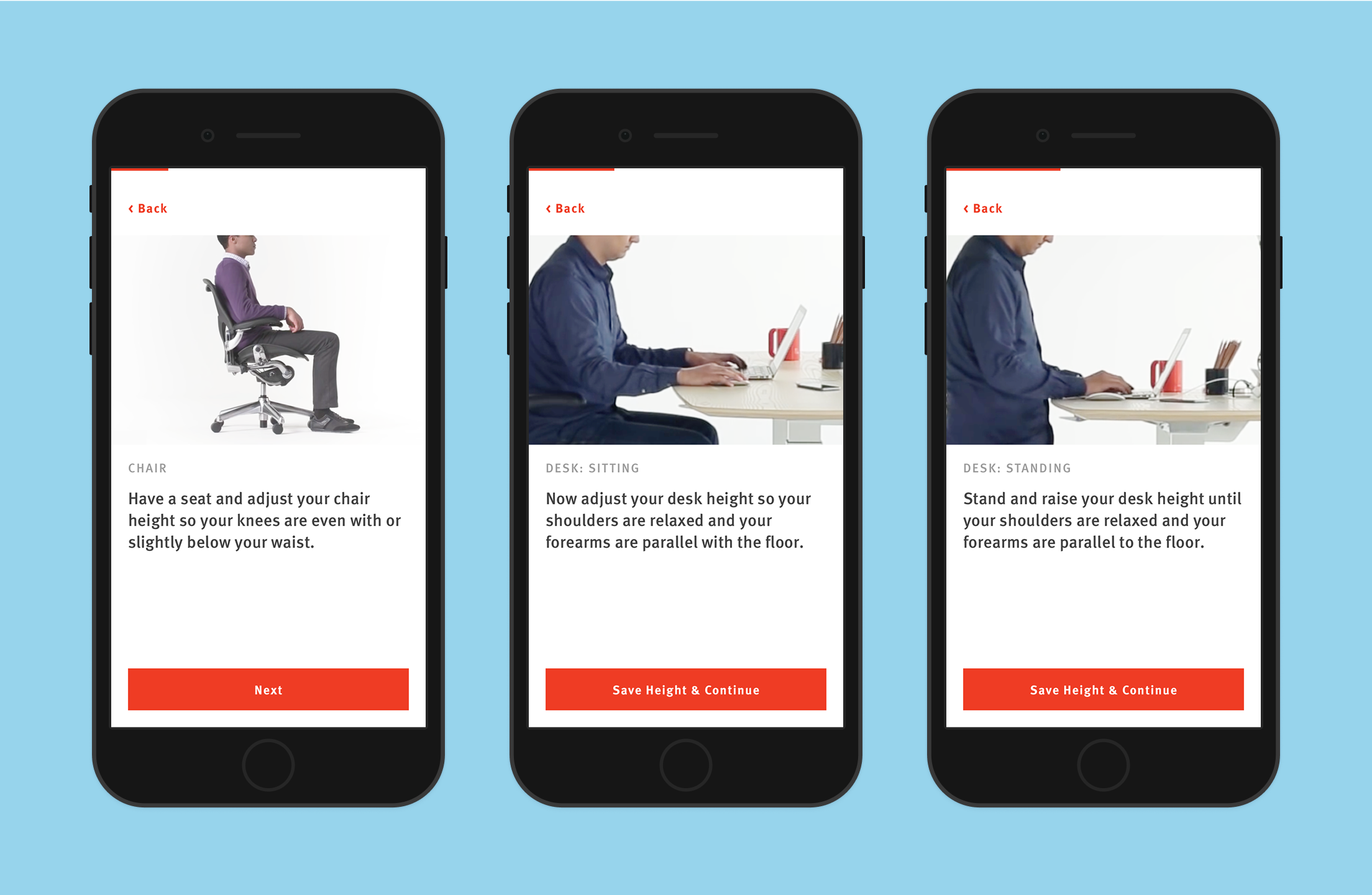
Personalize. Follow the steps to set your sitting and standing heights in healthy postures. Once set up, the app will remember these settings so you can take them with you to any hotel desk.

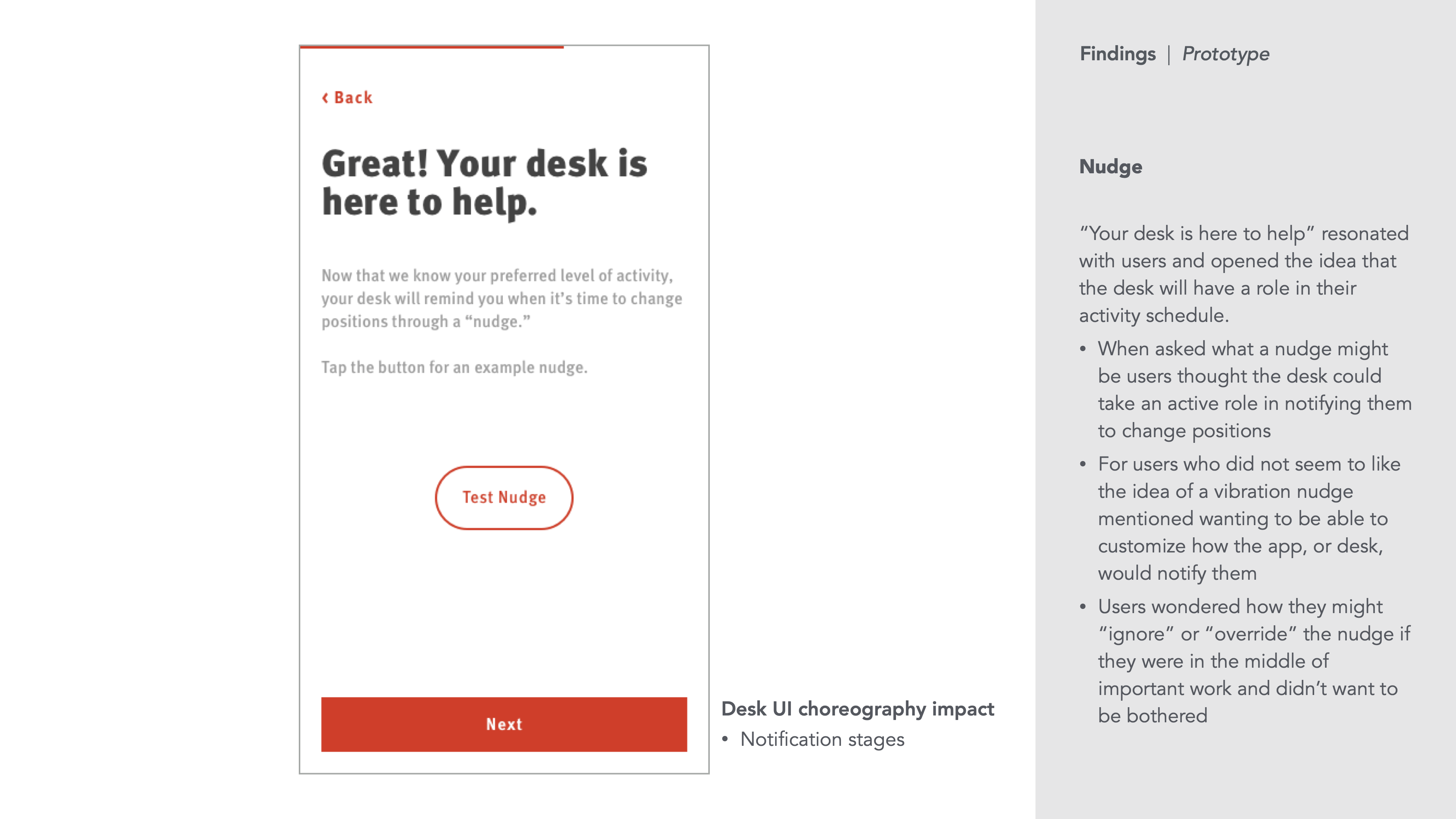
Stay active. Set a goal to keep yourself from staying still all day long. When it’s time to switch postures, the desk will remind you via gentle, physical cues (we hate distraction by push notifications, too).


IA & interaction design

We began by working with Herman Miller to understand their vision for the Living Office ecosystem and gather functional requirements for the app.

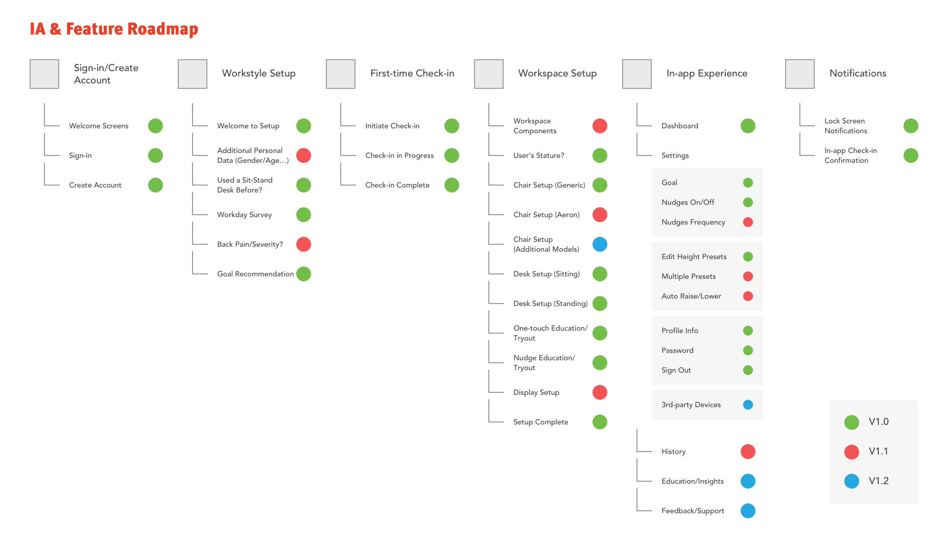
We ran a workshop with the client to identify the scope and priority of features. I then organized the outcome from the workshop into a hybrid information architecture & feature roadmap.

Next, we focused on the interaction flow of the app.

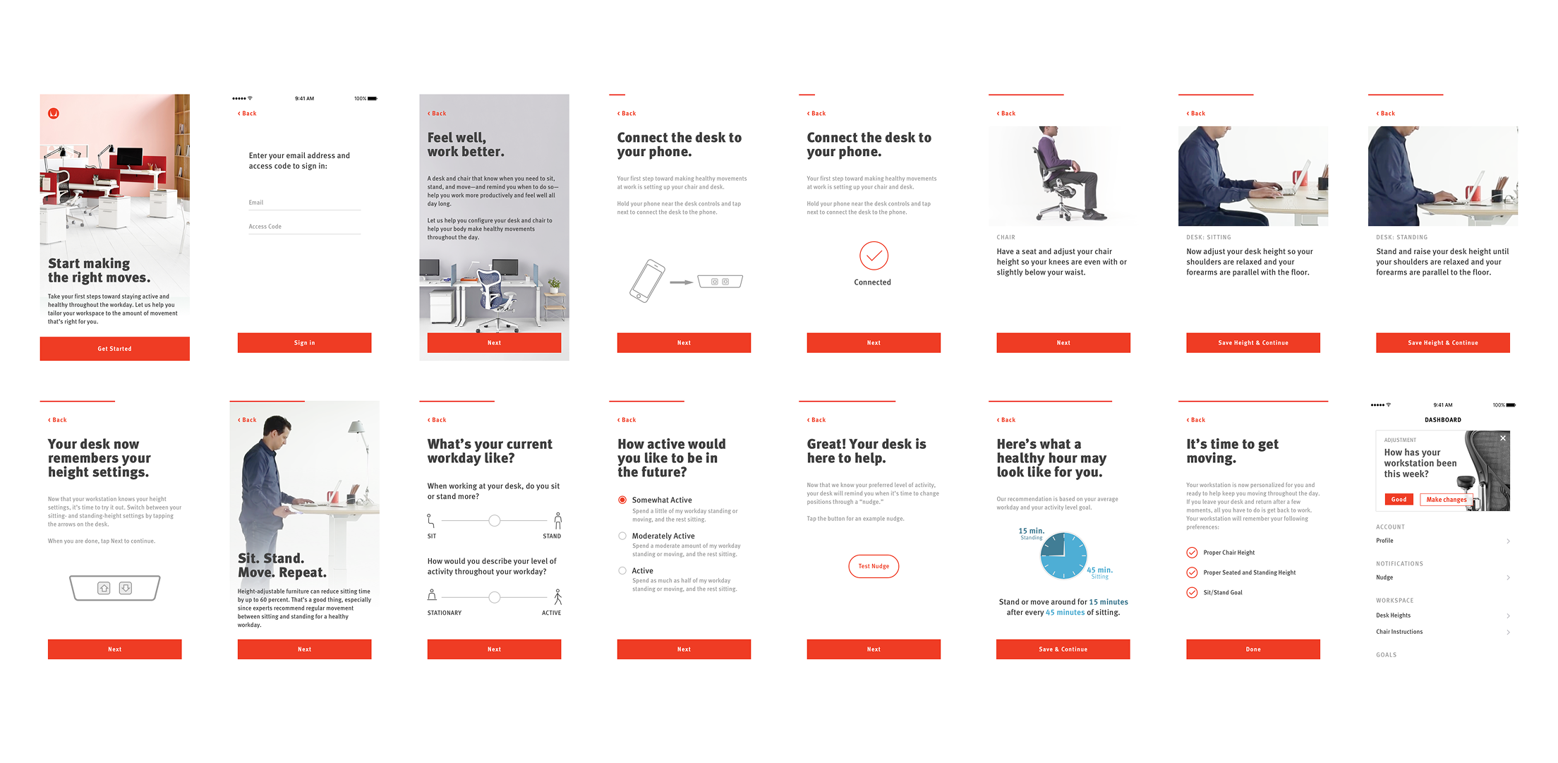
The app mainly consists of two parts: a wizard to guide users through the first-time setup and a dashboard to view goal progress or change preferences. We collaborated on the overall flow, then divided and conquered the individual screens. (I worked on the majority of the wizard flow screens.)

Before we moved on to visual design, there was one more thing we needed to iron out: What activity goals (sitting vs. standing) could we recommend to the user? As it turned out, that required some research and a little bit of maths.


What’s a good goal?

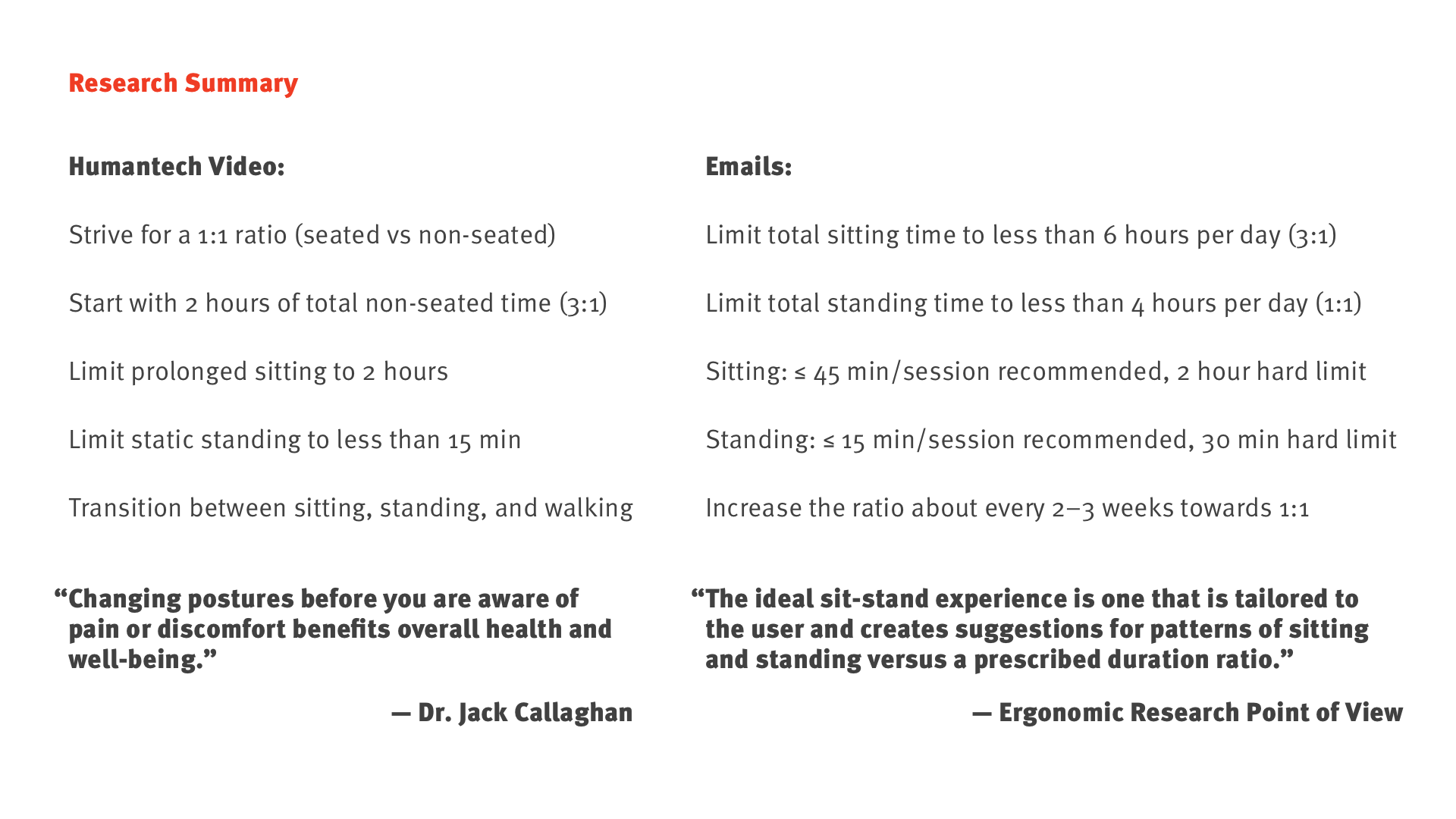
To come up with wellness goals that are both healthy and practical, we consulted with experts in ergonomics at Herman Miller, in addition to our secondary research on the topic. We then summarized our findings from those sources.

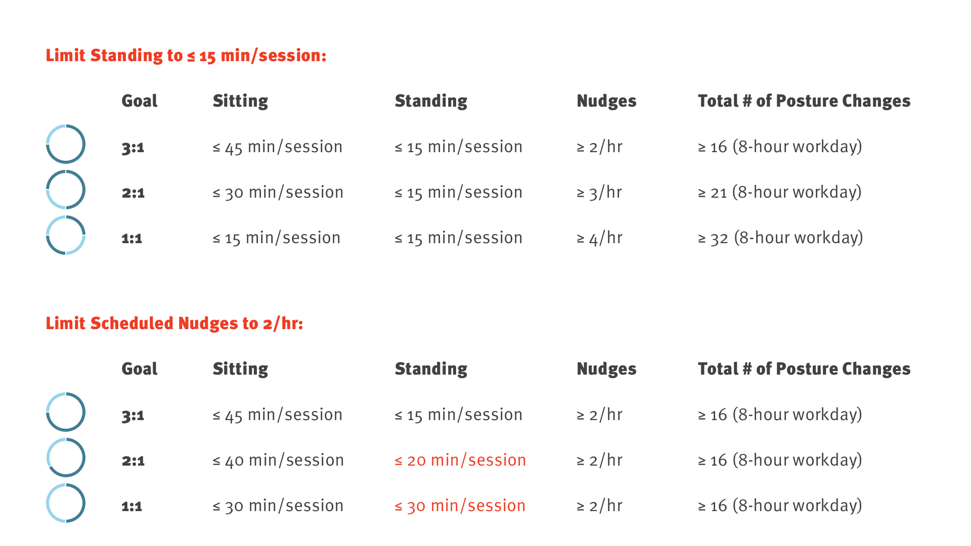
From a wellness standpoint, we need to avoid prolonged sessions for both sitting and standing. The recommended duration for continuous sitting is less than 45 minutes; standing, less than 15 minutes — or a 3:1 ratio. From there, we should encourage users to move towards a 1:1 ratio over time if their conditions allow.

Practically, however, it is a delicate balance between staying healthy and staying focused at work. For instance, if we follow the 15-minute rule for each standing session, and if the user sets a 1:1 goal for themselves, we would be reminding — interrupting — them every 15 minutes. That’s up to 32 times in a typical 8-hour day.

In the end, we landed on three goal settings:

These goals stay within the experts’ wellness guidelines while being practical and achievable. Regardless of which one the user chooses, we’ll send no more than 16 reminders in a working day.


A tale of two sliders

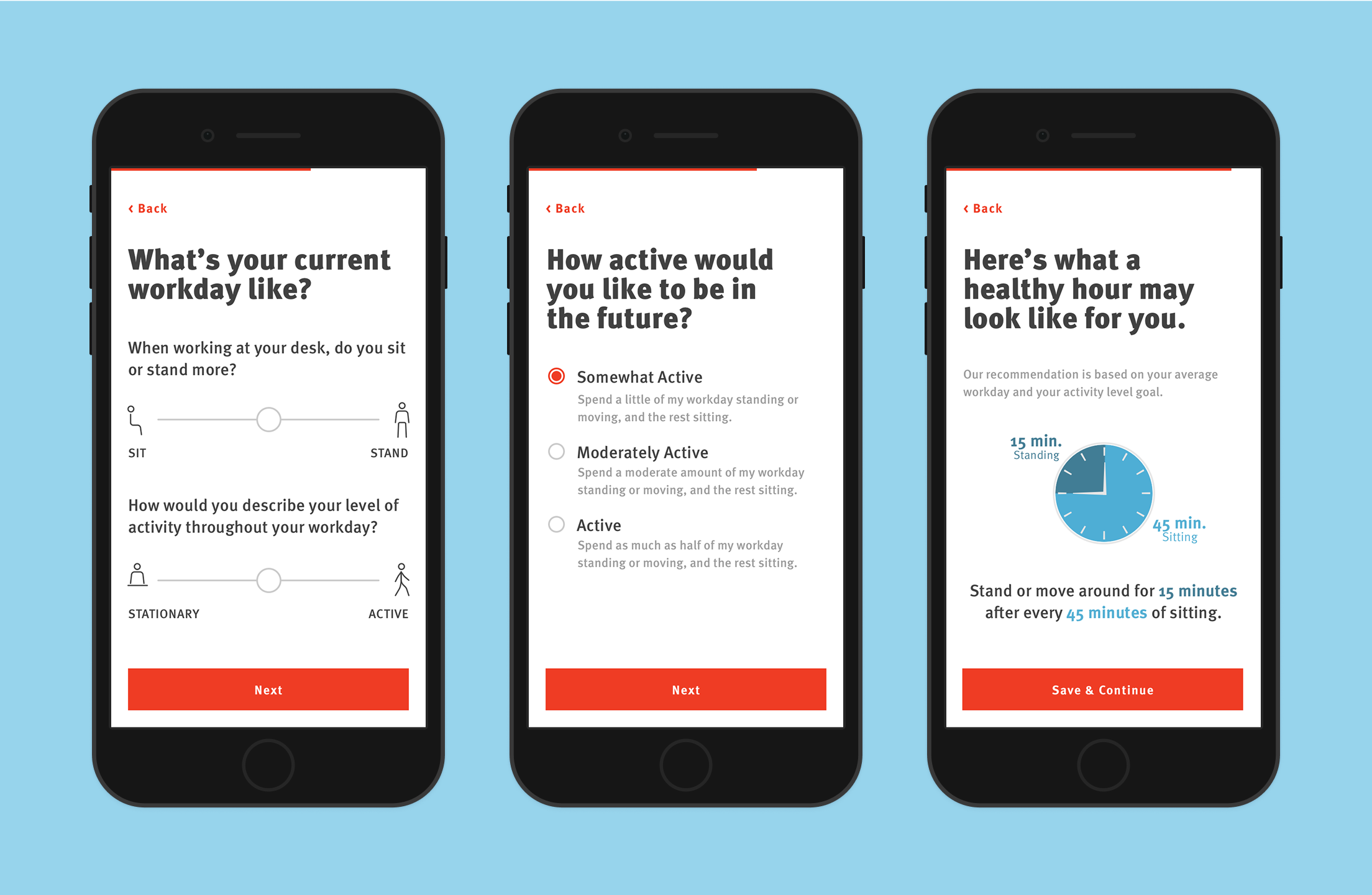
Now that we have the goals, how do we make a recommendation to the user? To do that, we need some input from them: what their current day is like and how active they’d like to be in the future.

The second part is simple: based on their input, we’ll adjust the goal to be higher or lower. The first part — generate a baseline goal from the user’s current activity level — is much harder.

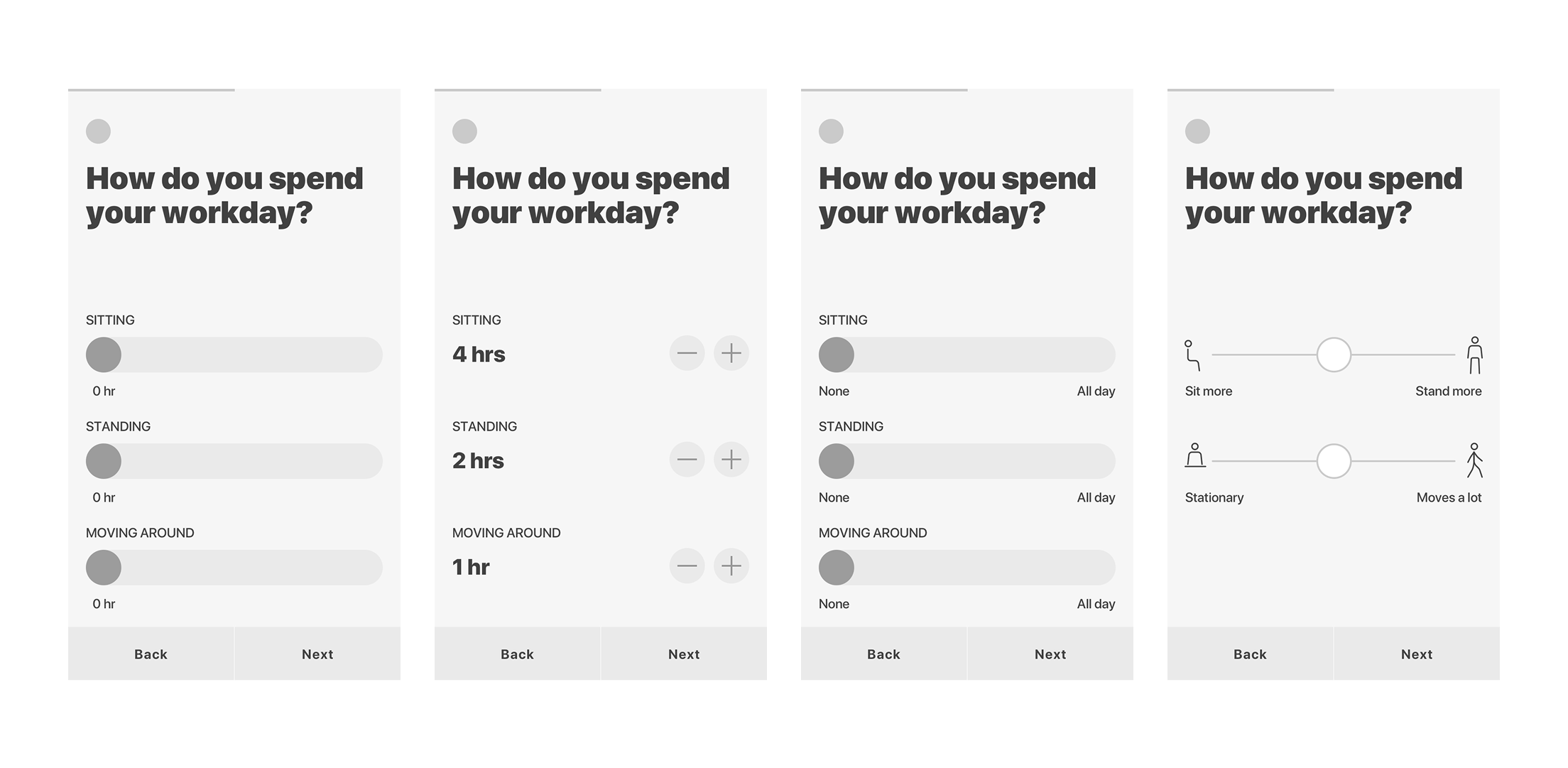
Our first attempt was straightforward: the time spent sitting, standing, and moving around each mapped to a slider. However, this approach relied heavily on the user to provide meaningful input, as each slider is independent of one another (what does it mean if all sliders are at 8 hours?).

Next, we tried steppers. This approach allowed us to limit the total to 8 hours and lock the controls when reached. But it was too restrictive for users who need to work more than 8 hours a day, and it felt cumbersome to use.

After the first two attempts, we went back to sliders: this time from “none” to “all day” instead of 0–8 hours. This change helped us realize that we were never concerned about the exact hours in the first place; what we wanted to know was the user’s general behavior: do they tend to sit more or stand more? And does their work keep them stationary at their desk or moving around the office space?

This revelation led to our solution in the end: two balanced sliders for qualitative rather than quantitative input.

Round 1: sliders.
“What if the user slides all of them to 8 hours?”
Round 2: steppers.
“What if the user works more than 8 hours a day?”
Round 3: back to sliders.
How they spend the time matters, not how much.”
Winner: balanced sliders.
“Ask about tendency, not time. Start from neutral.”

Usability testing

For this project, we worked closely with an iOS software developer from the very beginning. In addition to saving development time, it offered a unique opportunity to test the app — with real code — in its infancy.

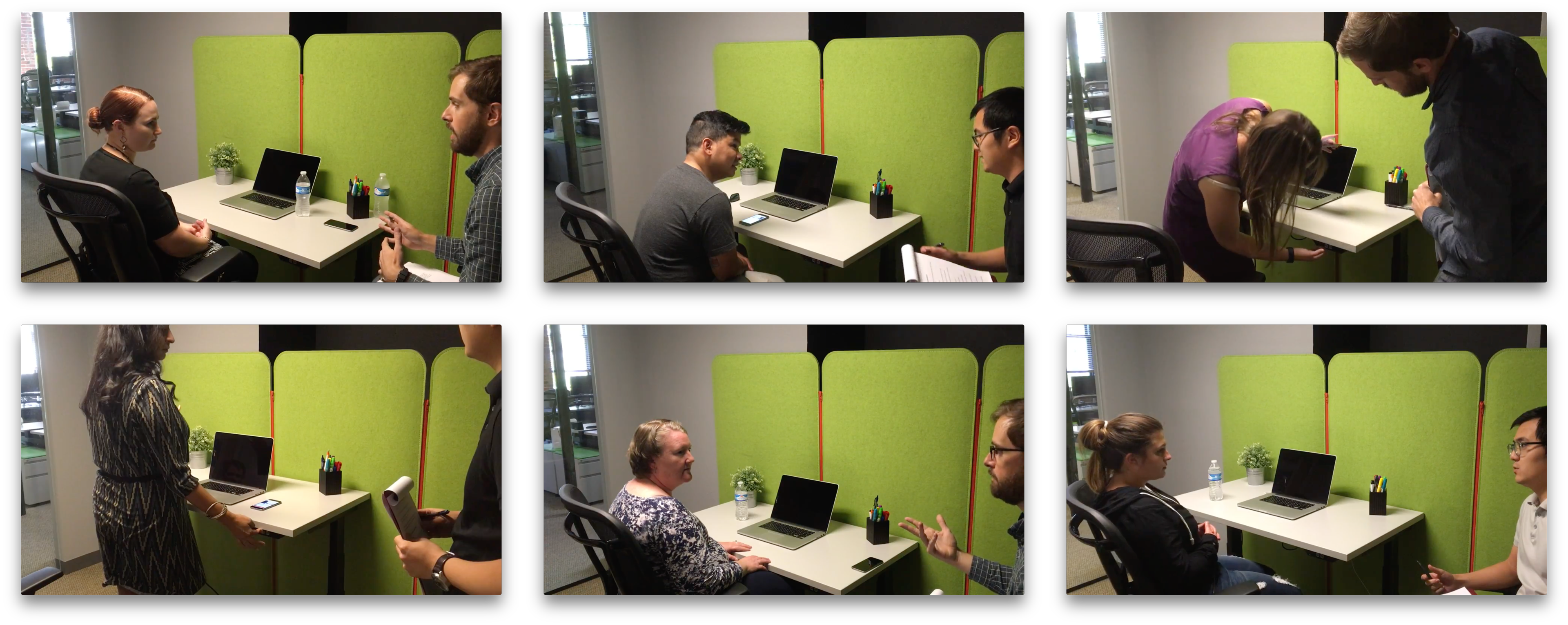
We set up a testing space in our office with a sit-to-stand desk (not the smart version) and a chair, then invited participants to use the app. Throughout the test, we asked them questions to understand their thought process; at the end, we gathered their evaluation and feedback of the app.

We alternated between moderator and note taker roles for each participant.
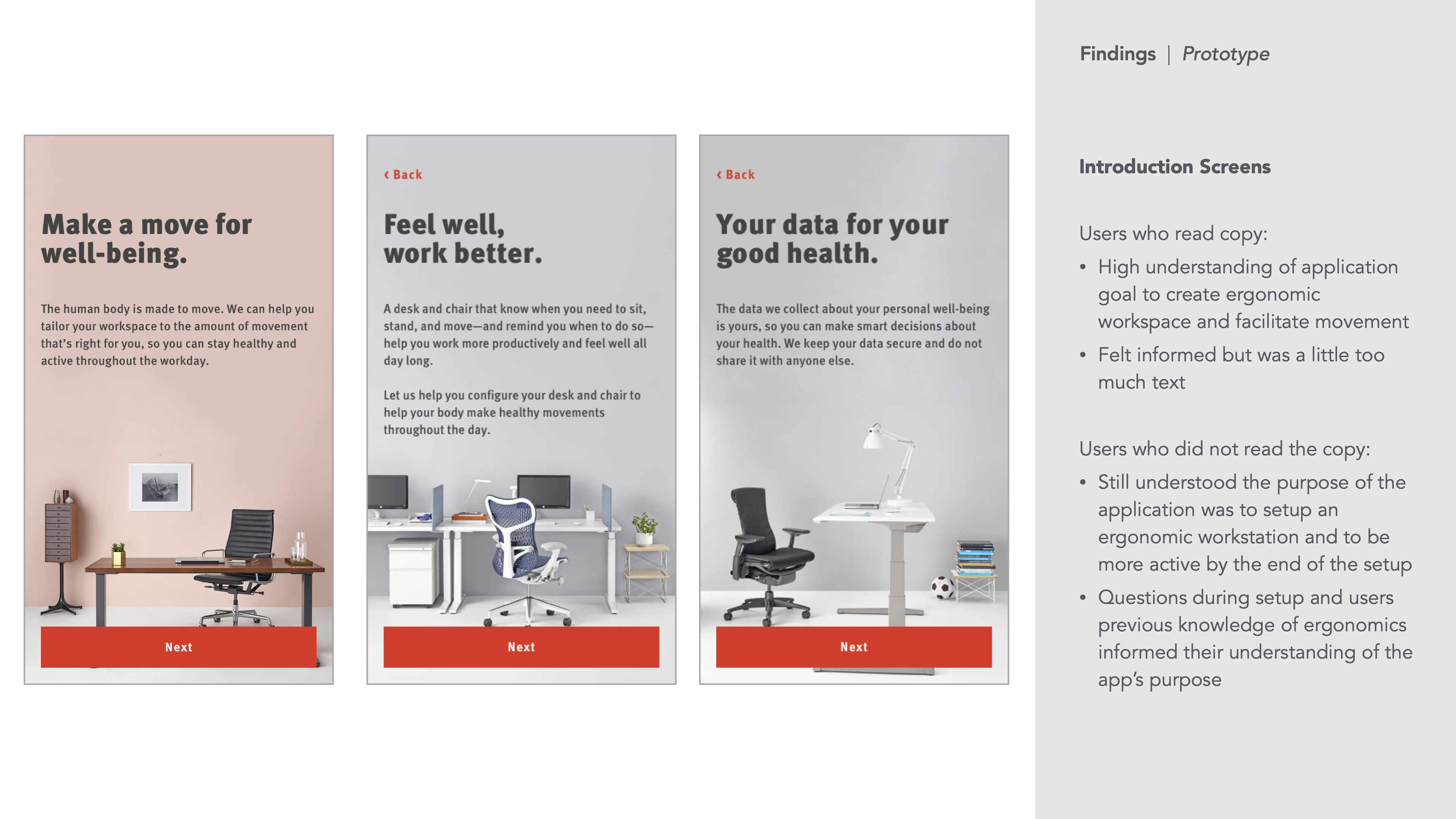
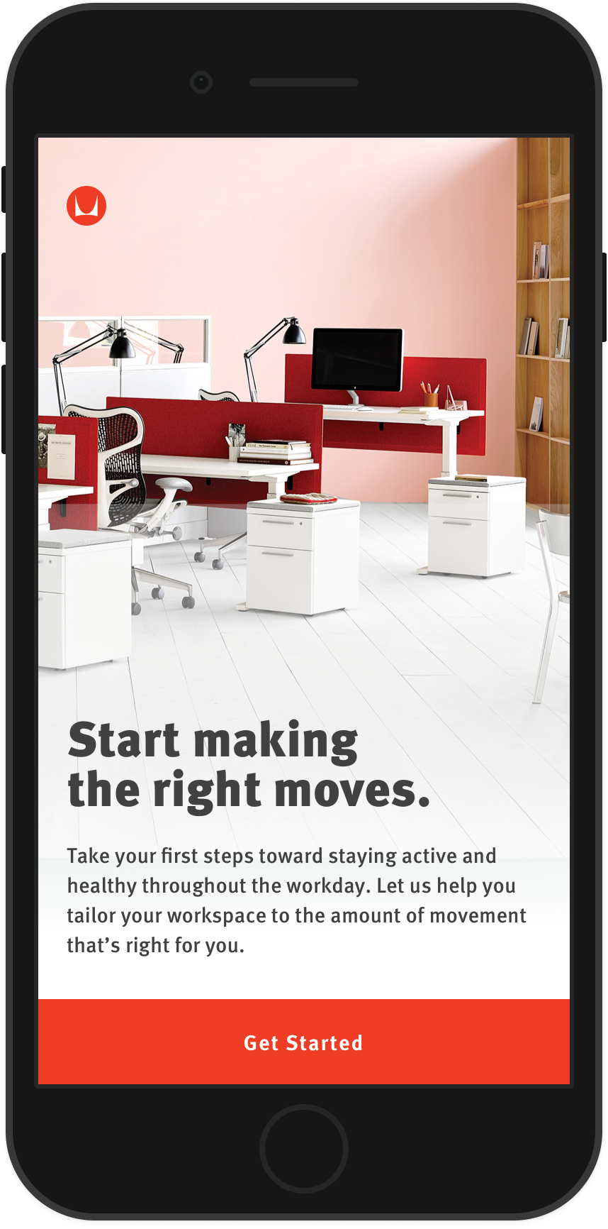
In the prototype, we had three wordy screens right after login. Most participants didn’t bother reading them, so we simplified the introduction to one screen in the new version.
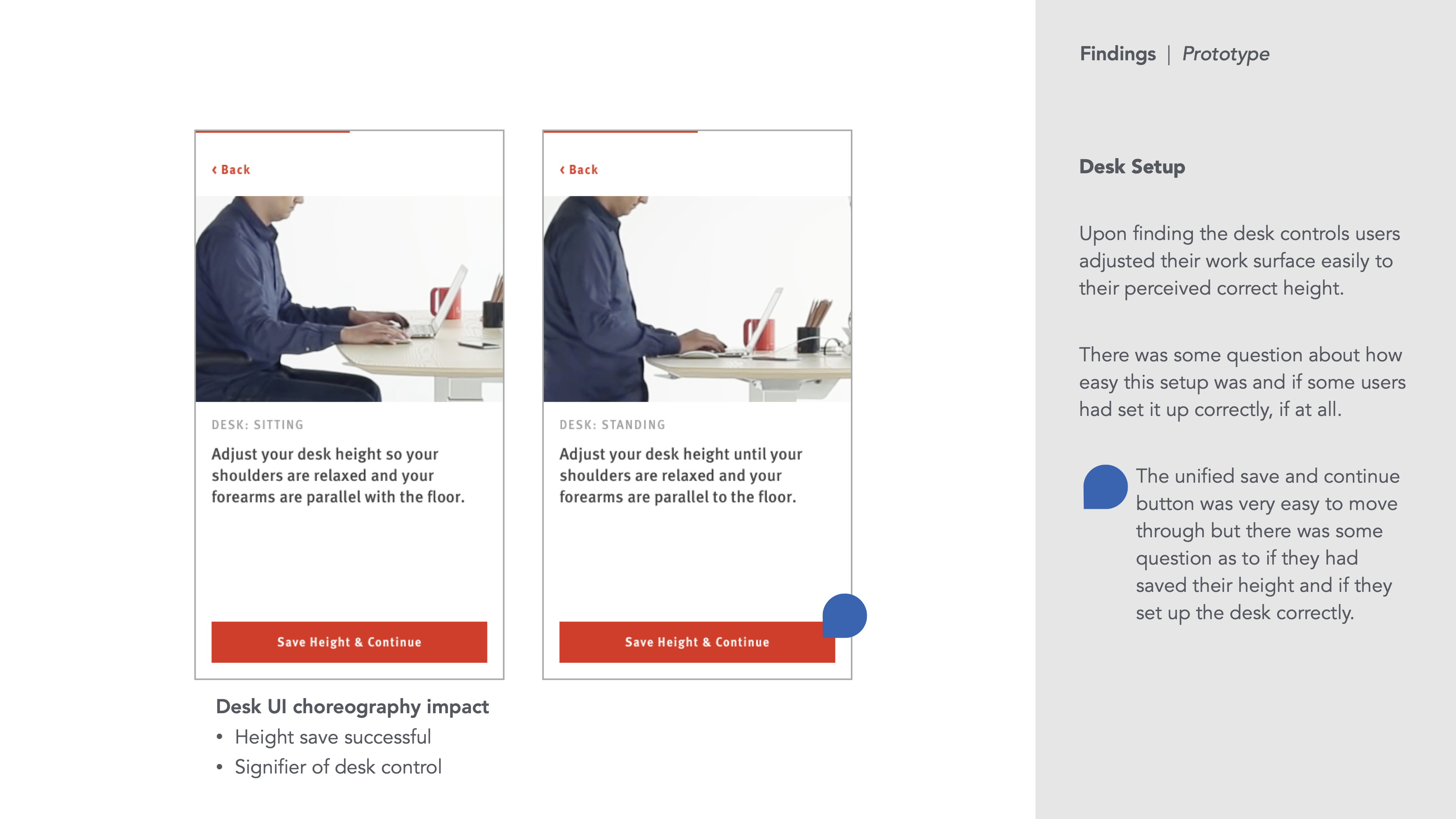
Participants followed the instructions for setting up the chair & desk without any issue.
Limited by our test setup, we couldn’t replicate the desk’s behavior when controlled by the app. Instead, we described what would happen and gathered the participants’ feedback.

Project artefacts

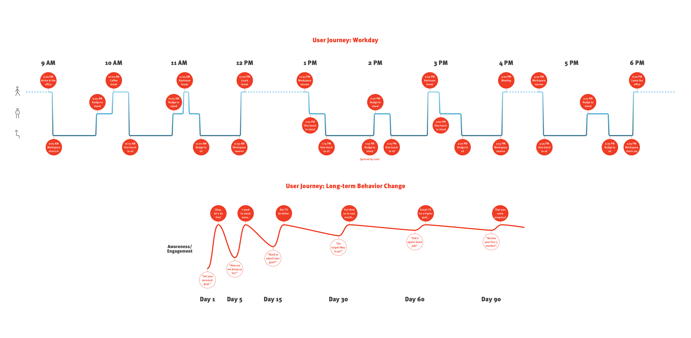
A journey map to study the user’s touchpoints with the app in a day and over months.
Select screen mockups produced for the app.
A style guide (based on Herman Miller’s brand guidelines) for consistency across design and development.