Center Without Walls
Patients with kidney failure rely on hemodialysis to stay alive. This treatment removes waste and toxins from their blood, effectively functioning as their kidneys. Typically, a patient is treated three times a week for 3–4 hours each.
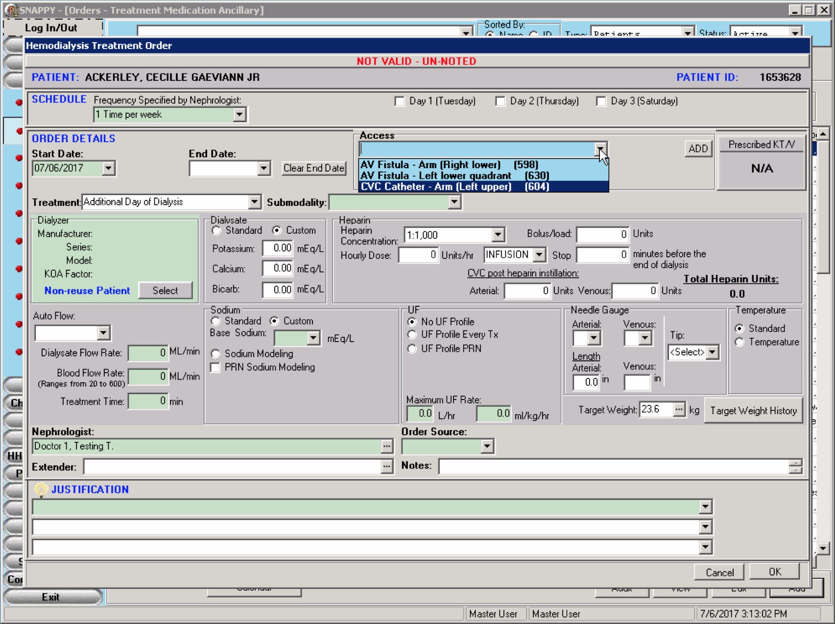
DaVita operates over 2,000 dialysis clinics across the U.S. Clinicians rely on software systems to manage patient records and their facility, but those systems are outdated and siloed. We need a new system that breaks down the walls.
Center Without Walls replaces several disconnected programs with an integrated web platform. Clinicians have all the information they need in one place, from patient details and treatment orders to shift schedules and inventory.
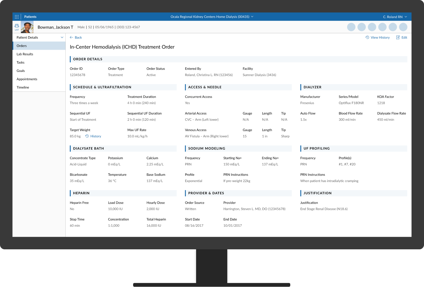
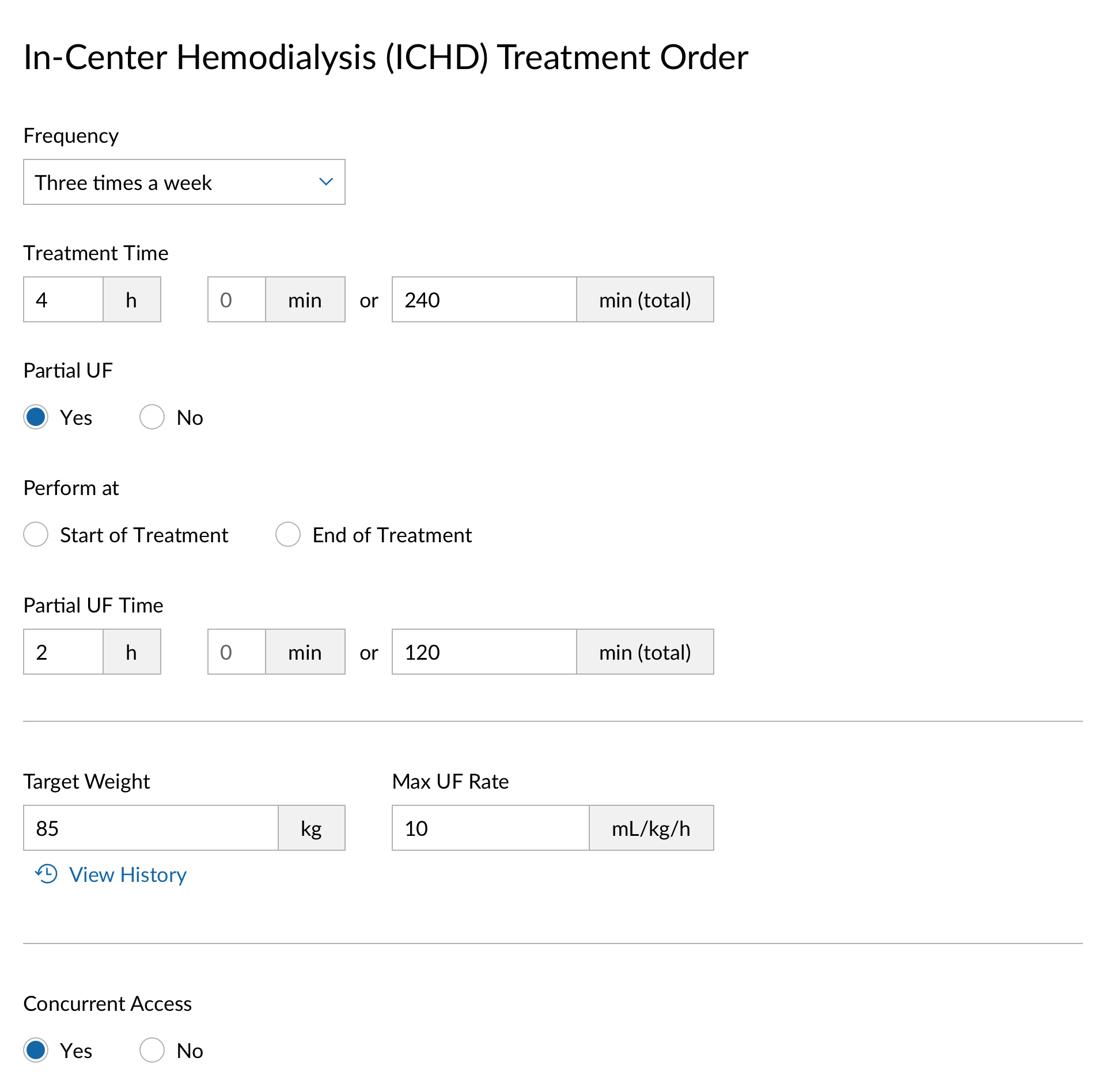
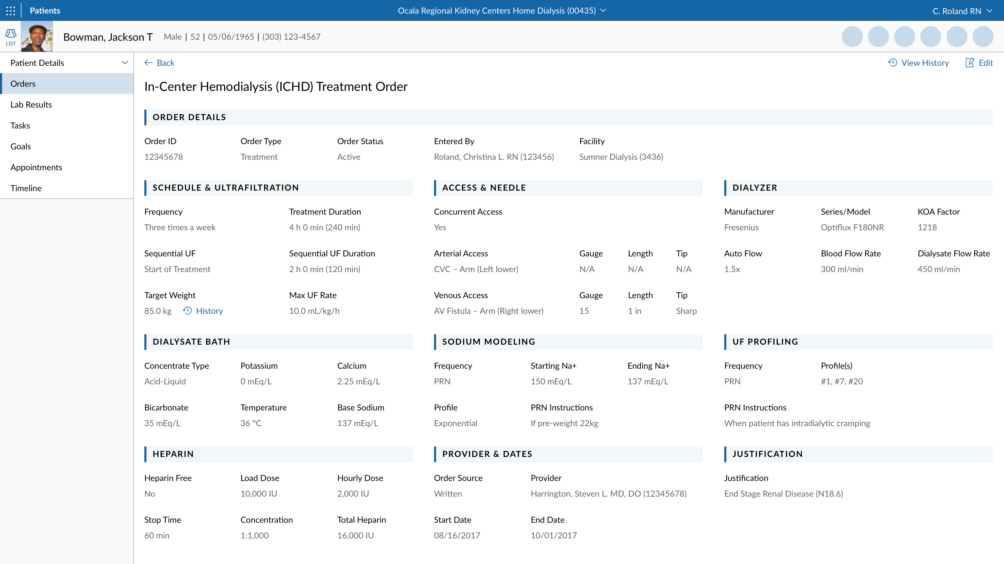
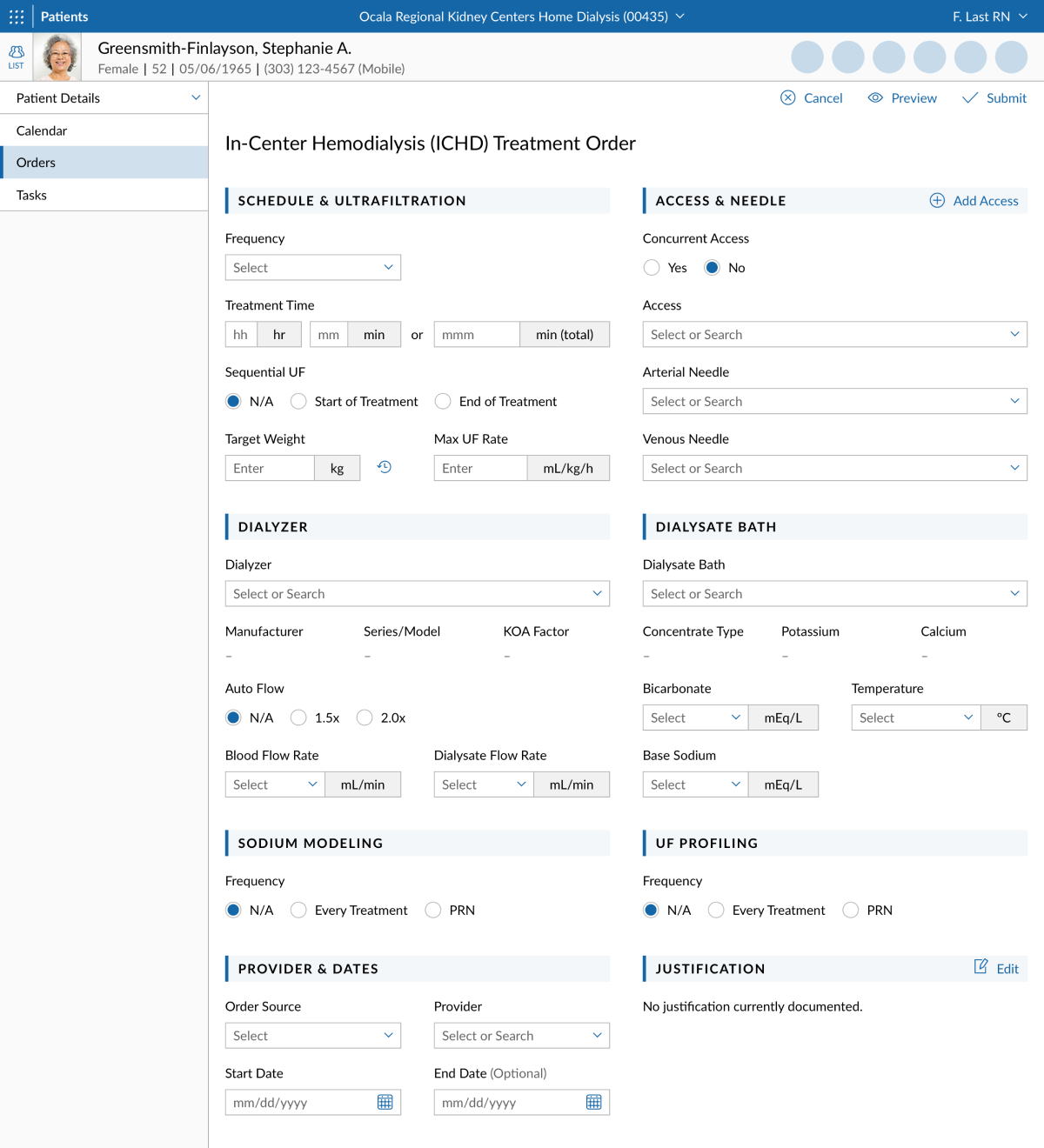
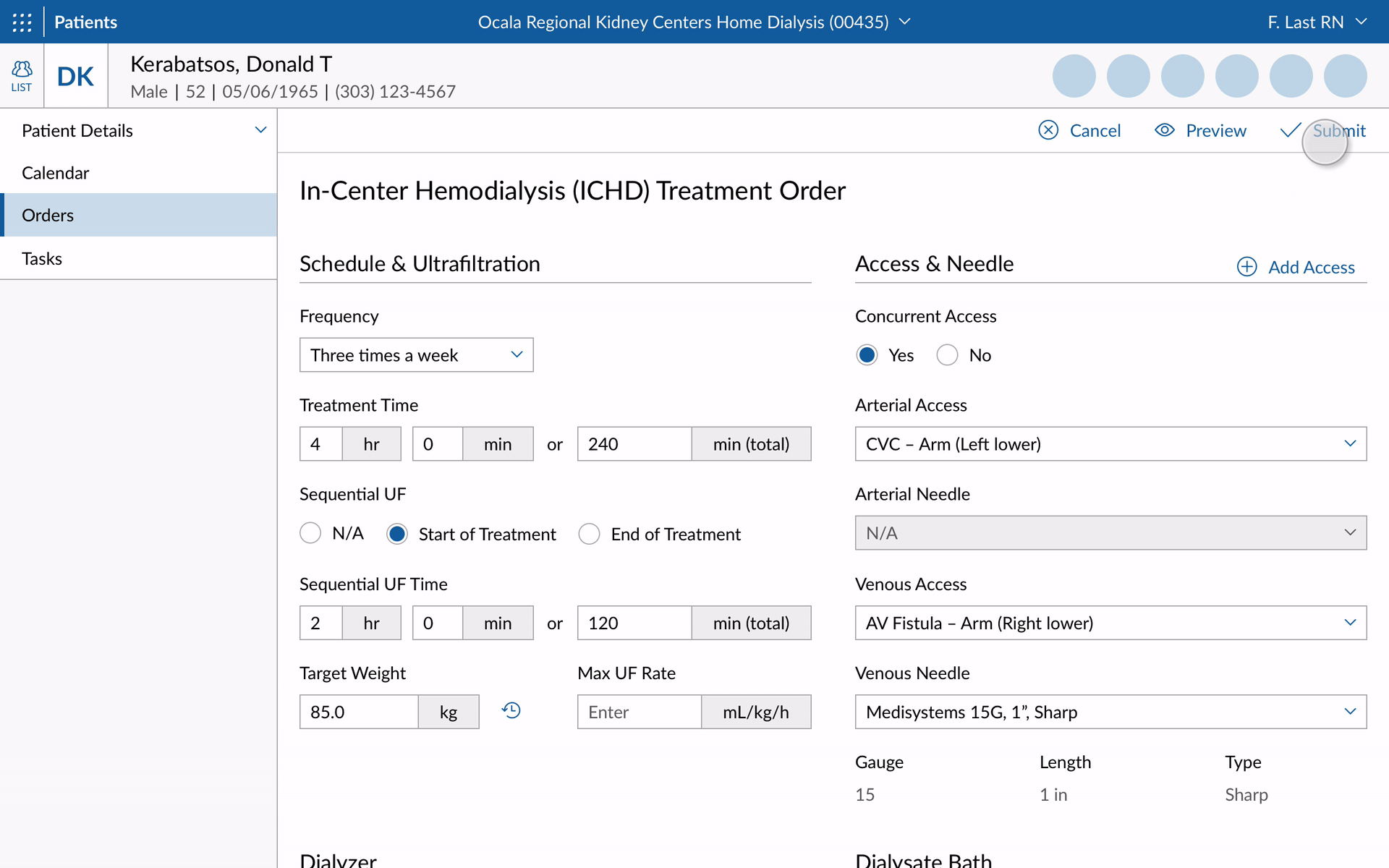
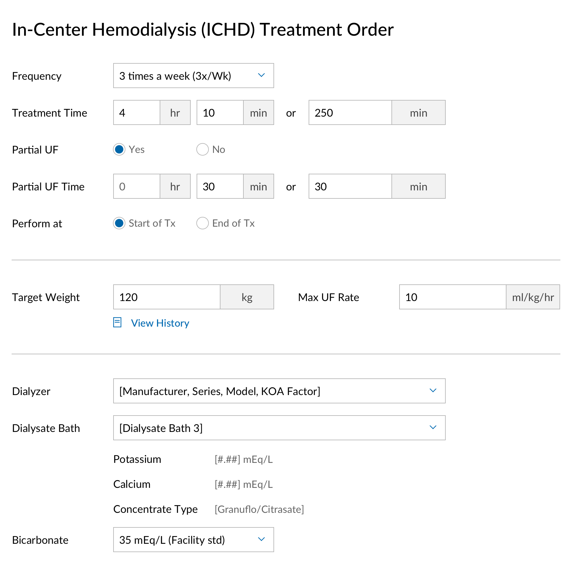
Treatment order
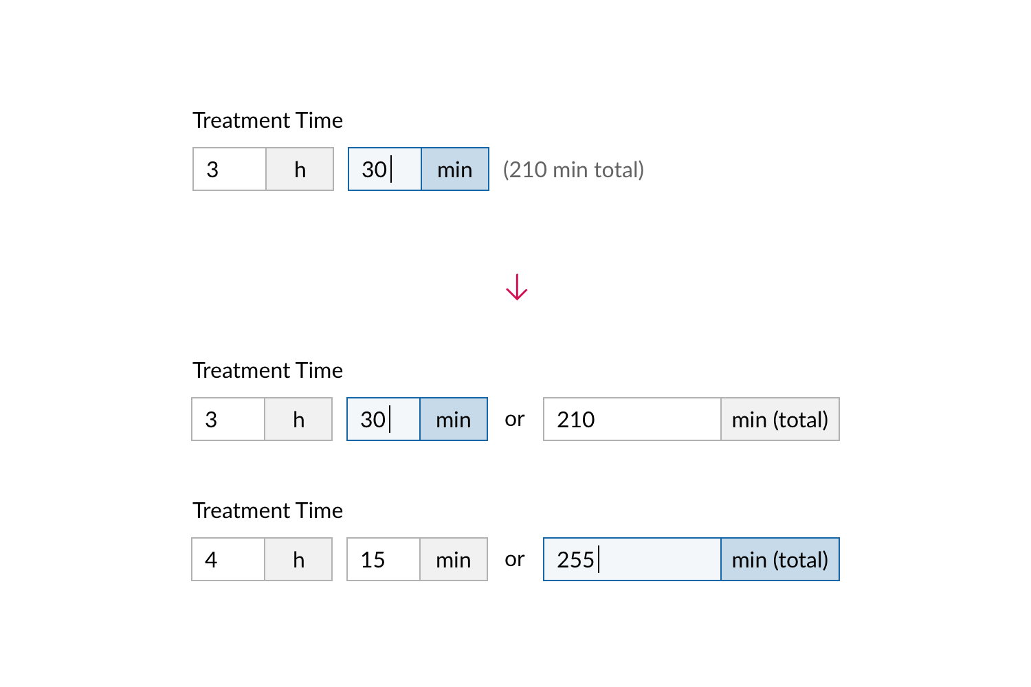
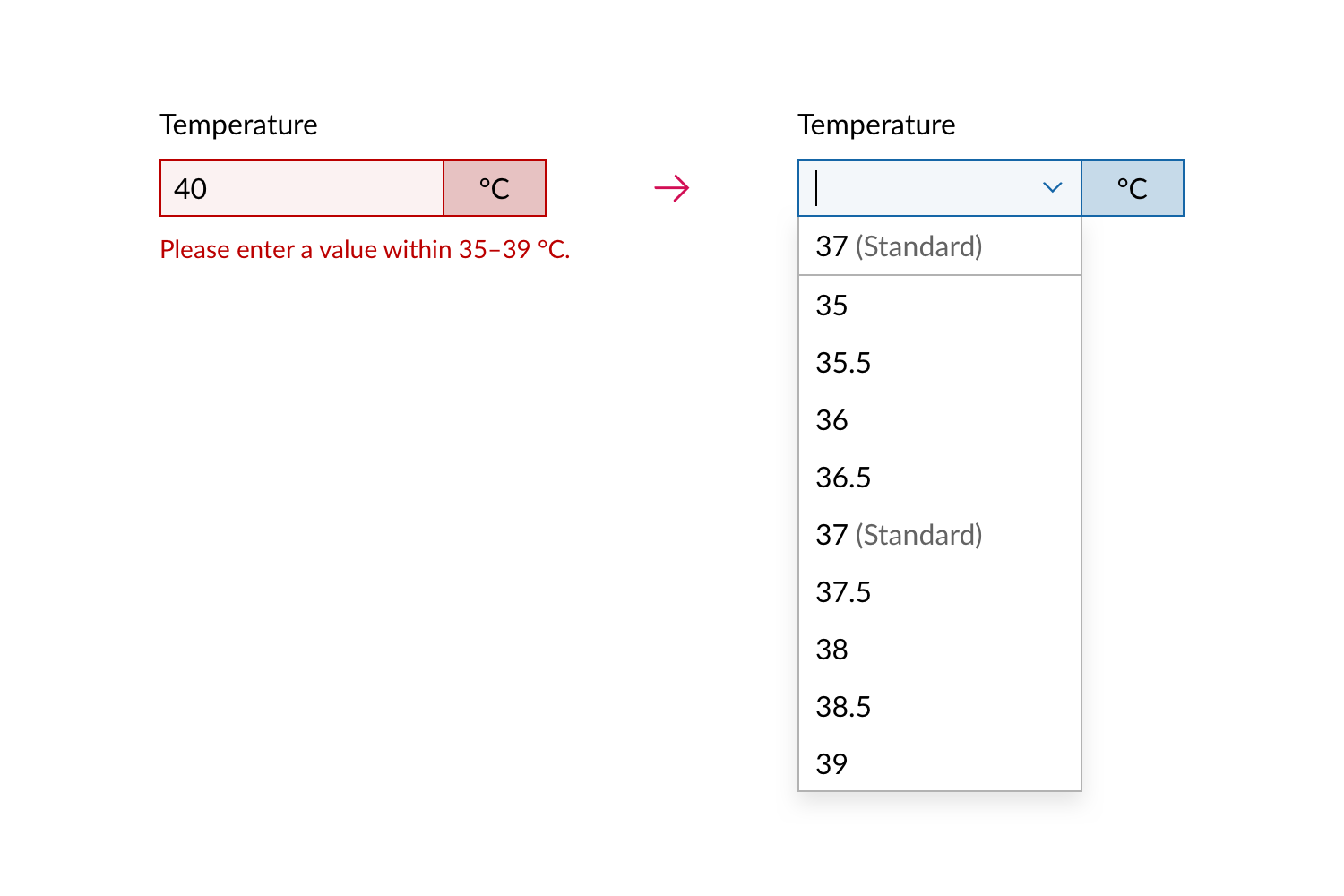
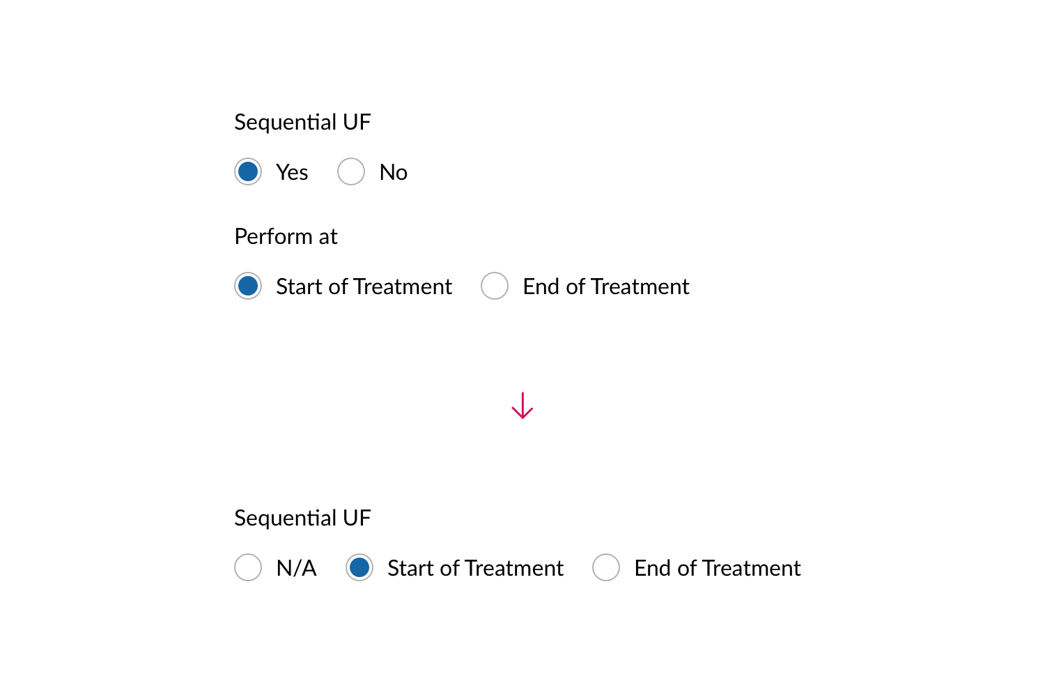
The treatment order contains details on a dialysis treatment prescribed by a doctor. Nurses and technicians use it to set up the dialysis machine and administer the treatment for patients.
To maximize efficiency and minimize errors, the order form provides automatic unit conversions, suggestions for standard values, and validations before submission.
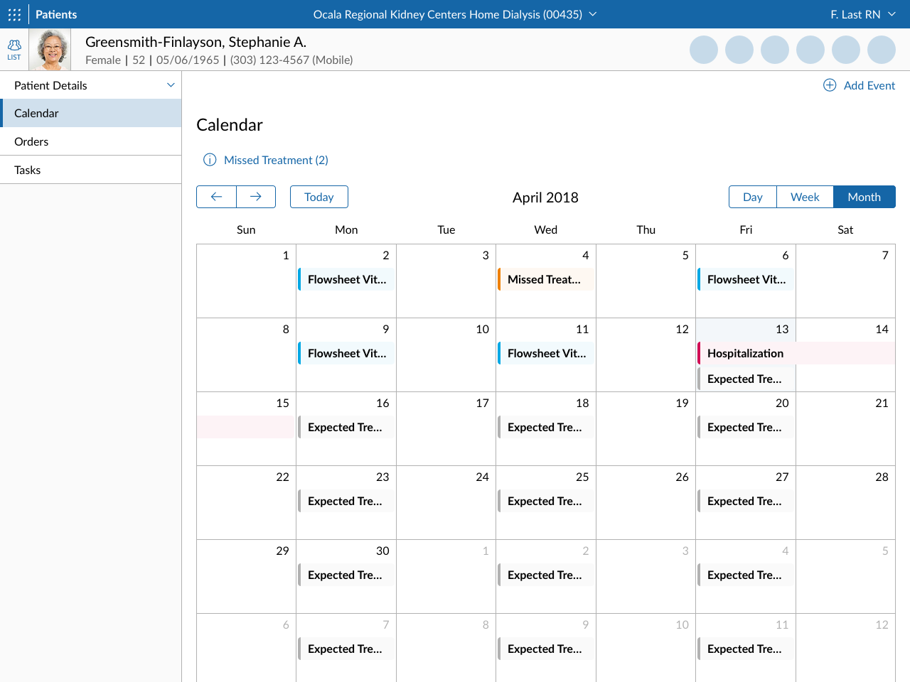
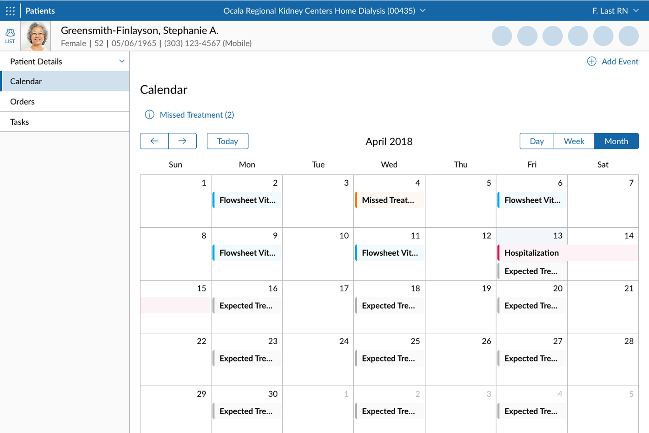
Patient records
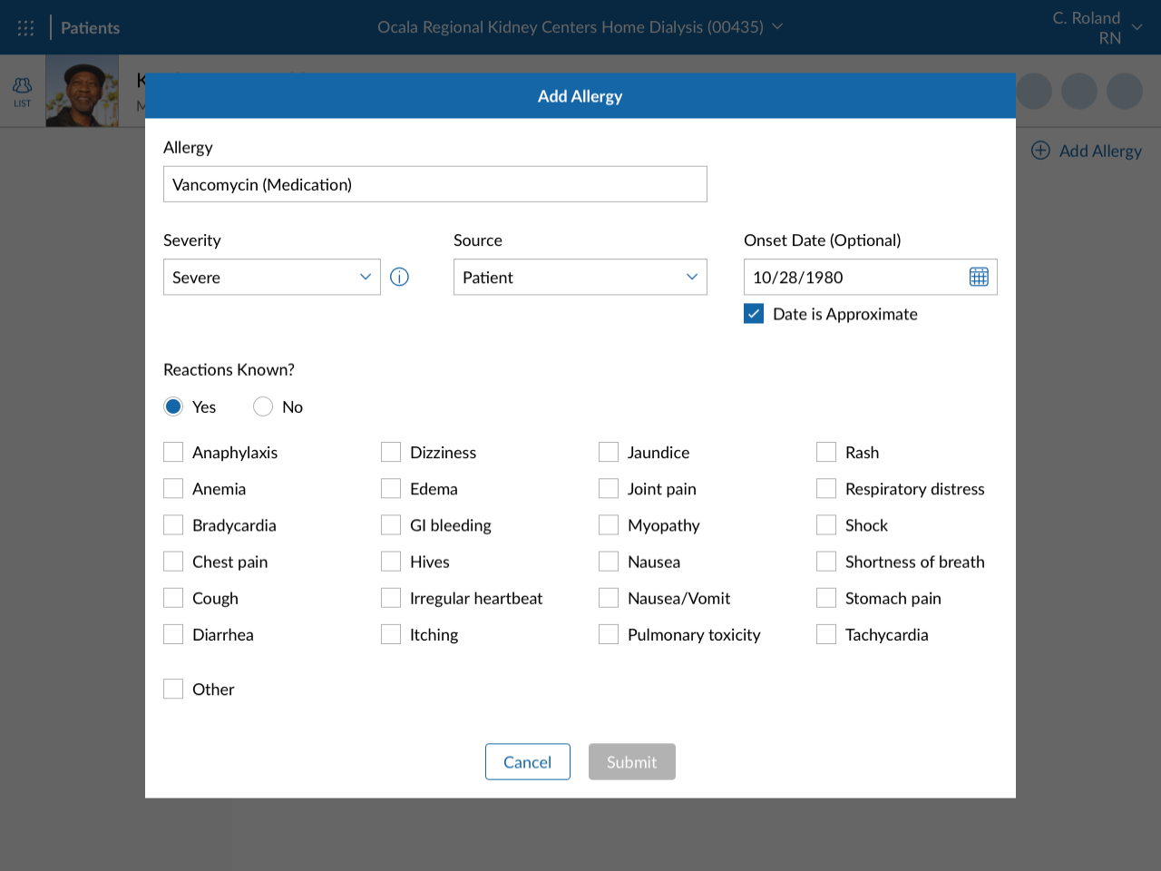
In addition to treatment orders, the patient module in Center Without Walls also stores patient information such as allergies, vital measurements, and treatment schedule.
Facility management
The facility module allows clinicians to manage their clinic, such as shift schedules, treatment standards, and inventory.
Project artifacts