Axon Records
Save time, save lives
Law enforcement officers frequently spend 2–3 hours writing reports — more than a quarter of their shift. After responding to an incident, they need to document what happened and what they did, which are used for further investigation and in court.
Thus we have the impossible trinity of incident reporting: accuracy, thoroughness, and speed. Legal consequences dictate that accuracy is paramount; thoroughness can be the difference between an unsolved case and a solved one. How do we improve speed without sacrificing the other two?
Axon Records aims to reduce officers’ time spent on paperwork in half: a flexible report for capturing the structured data of an incident; a simple yet powerful text editor for writing narratives; plus real-time collaboration for multiple officers to work on the same incident.
One report to document them all
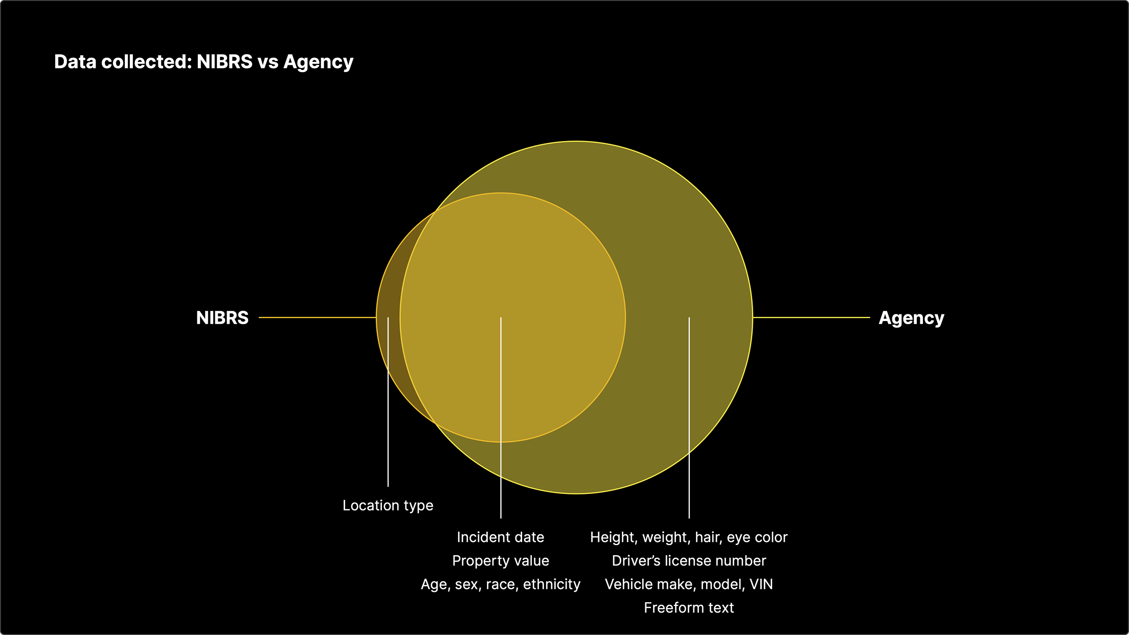
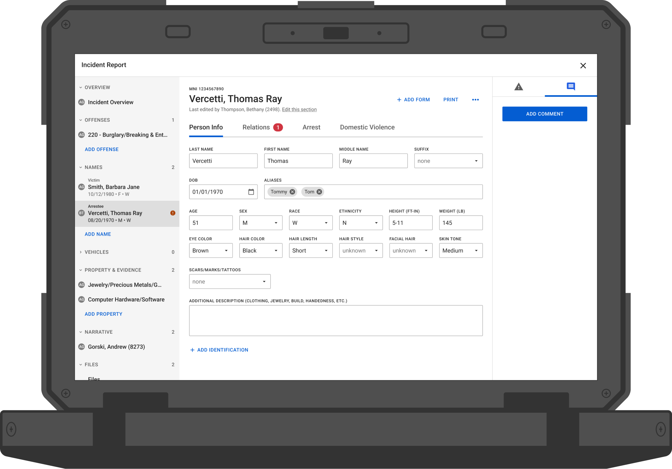
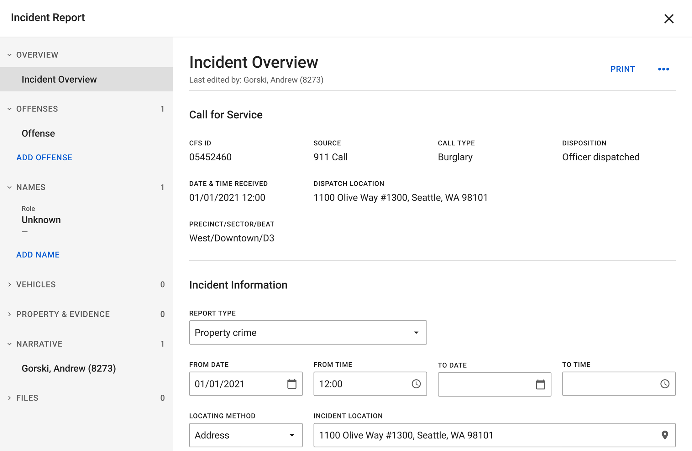
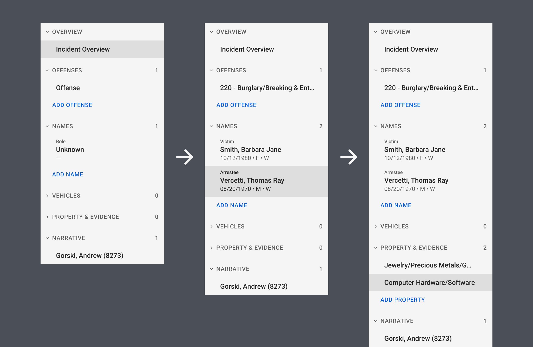
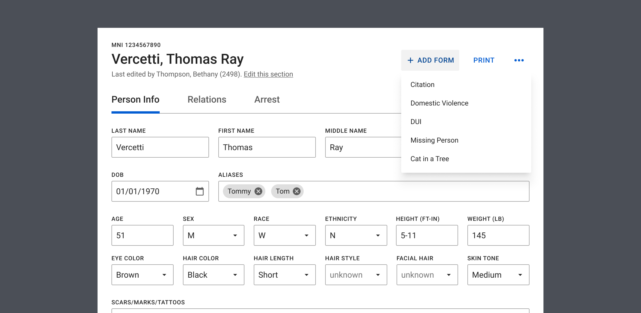
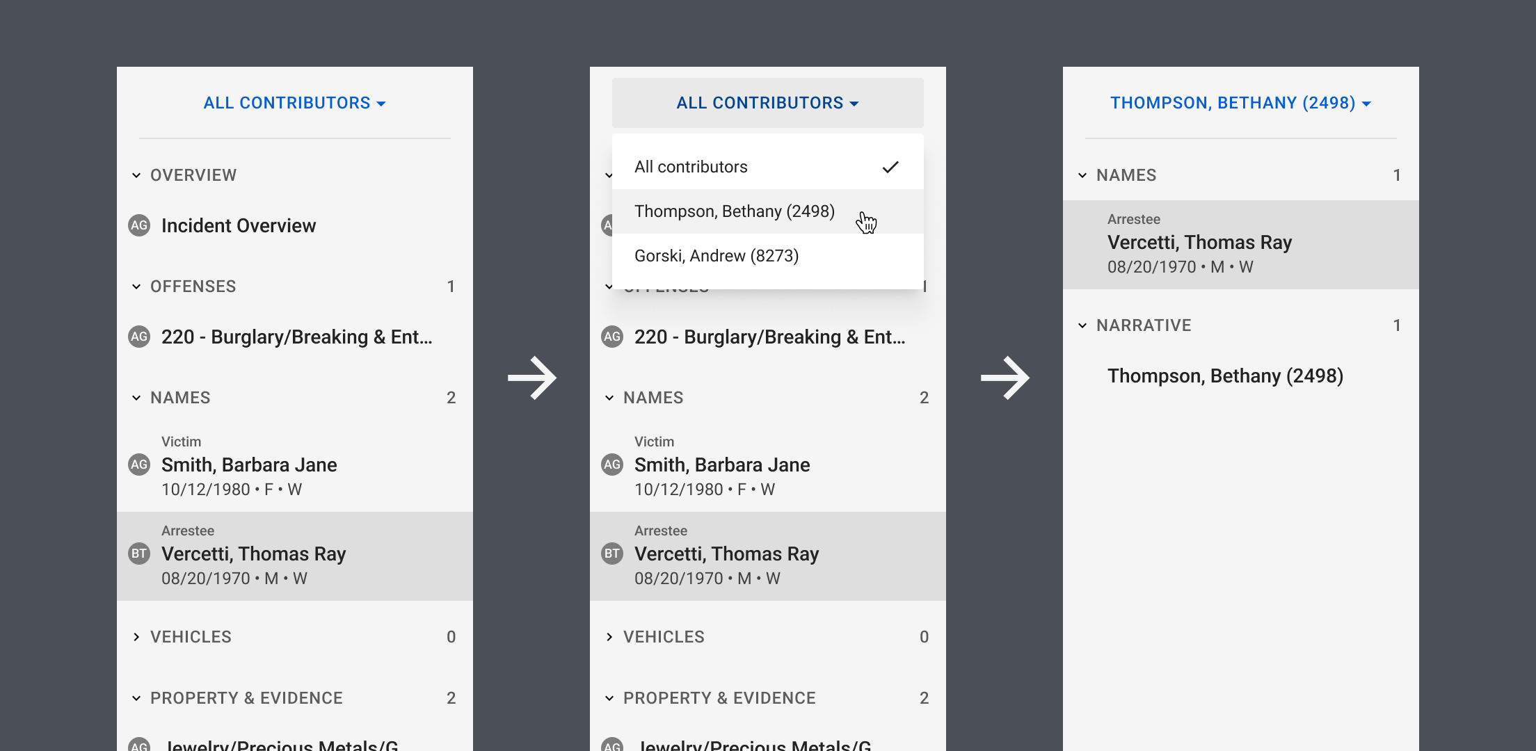
In the past, law enforcement agencies used various paper forms to document an incident. Driving under the influence? Use a DUI form. Stolen valuables? Pull out a property sheet. Arrests made? Fill out an arrest report — one for each arrestee.
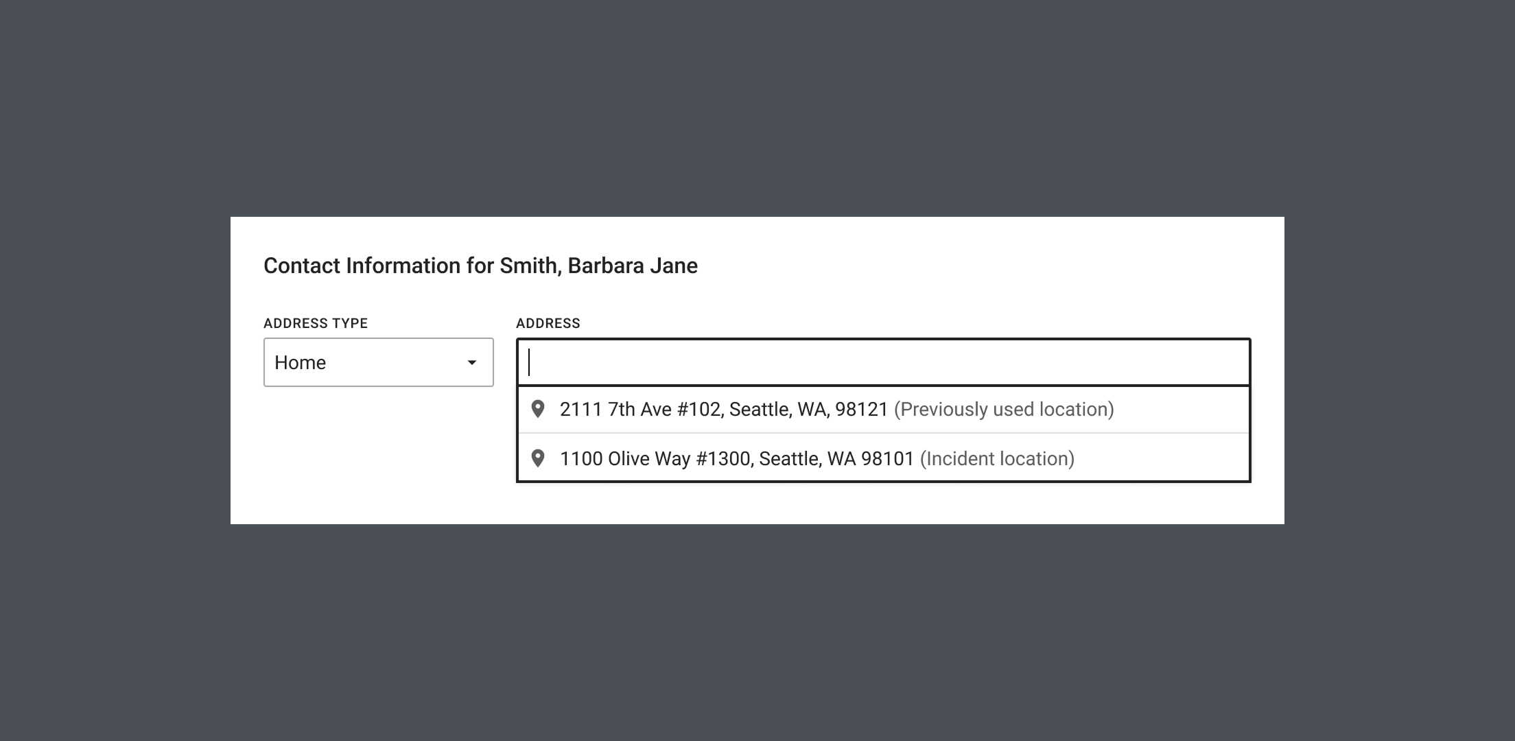
This created two problems. First, key elements of an incident — names, addresses, vehicles, etc. — often need to be filled out many times in multiple forms, wasting time and introducing human error. Second, updates to those elements — name of a previously unknown victim, license plate of a suspect’s car — can’t easily propagate through all reports, making it difficult for investigators to understand the latest status of an incident.
When agencies moved to digital, the computer systems they used usually inherited these problems rather than fixing them. We can do better. In Axon Records, our goal is to never make you enter the same information twice, and to always keep the facts up to date. To do that, we created a dynamic report that can be tailored to each incident and expanded as it develops.
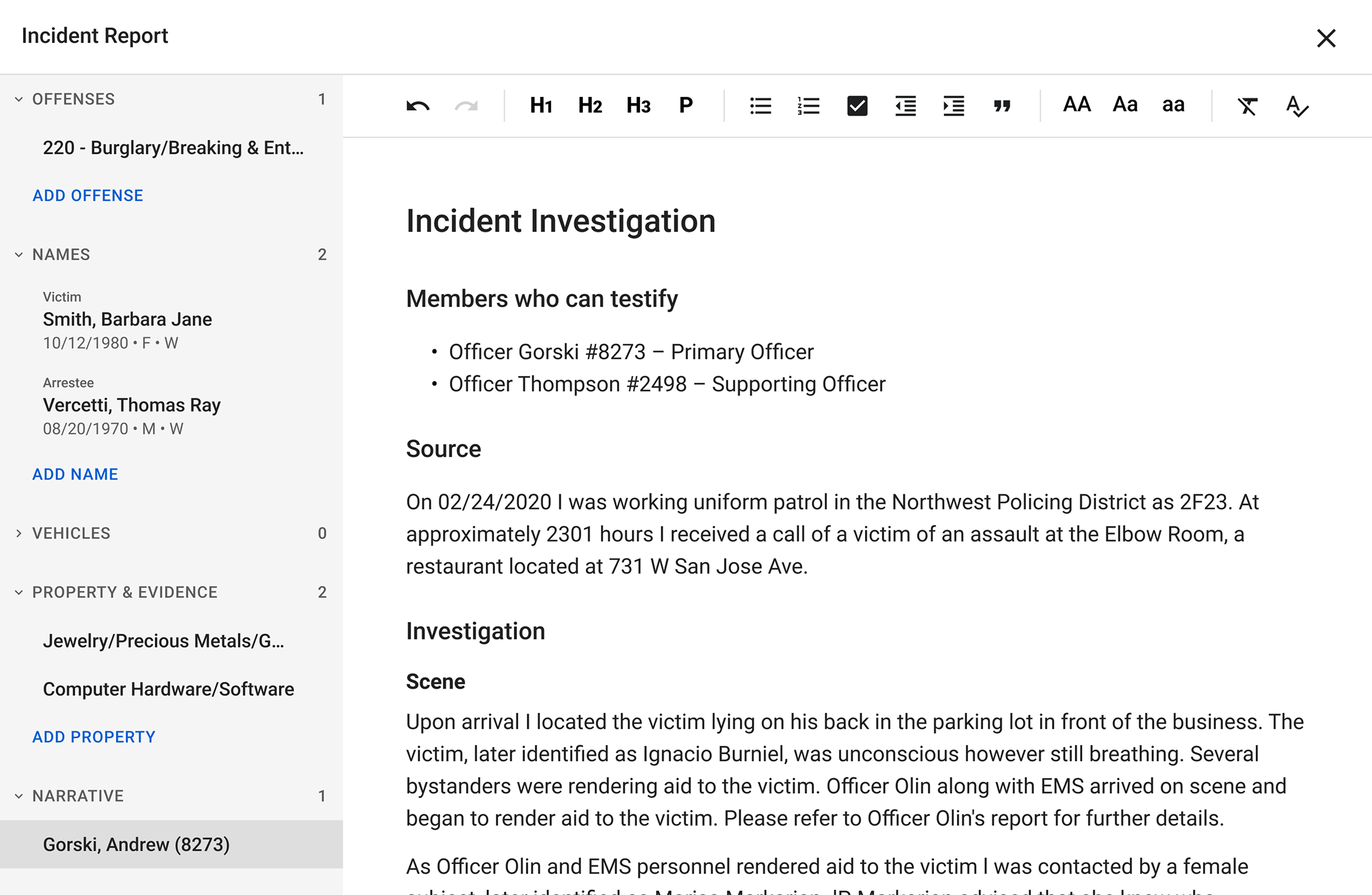
Narrative editor
Officers spend the bulk of their time writing the narrative: their account of what happened, who was involved, and what they did at the scene. It’s the “police report” we commonly think of.
When writing a narrative, officers typically follow a template for the type of incident they’re documenting. They start by making a copy of the template file in Microsoft Word, then continue to fill in the details. Once the narrative is complete, they copy and paste it into the reporting software used by their agency.
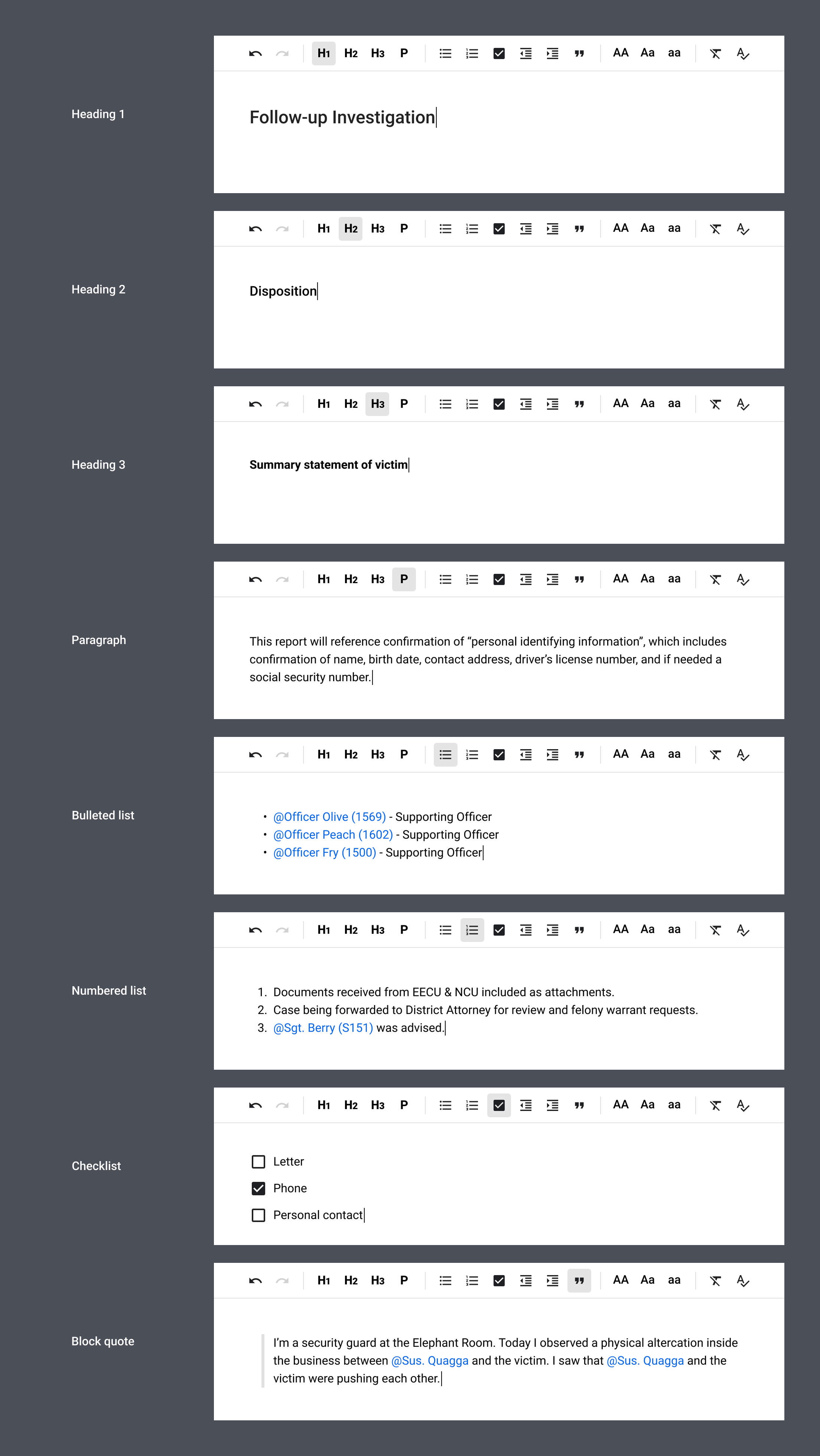
We want to offer a compelling alternative to writing in Word. First, we worked with agencies to integrate their templates into Axon Records. Then, we built a narrative editor with only the essential writing tools officers need, plus autosave to the cloud so they never lose their work. For those still unconvinced, we made an effort to preserve text formatting when a narrative is pasted into Axon Records.
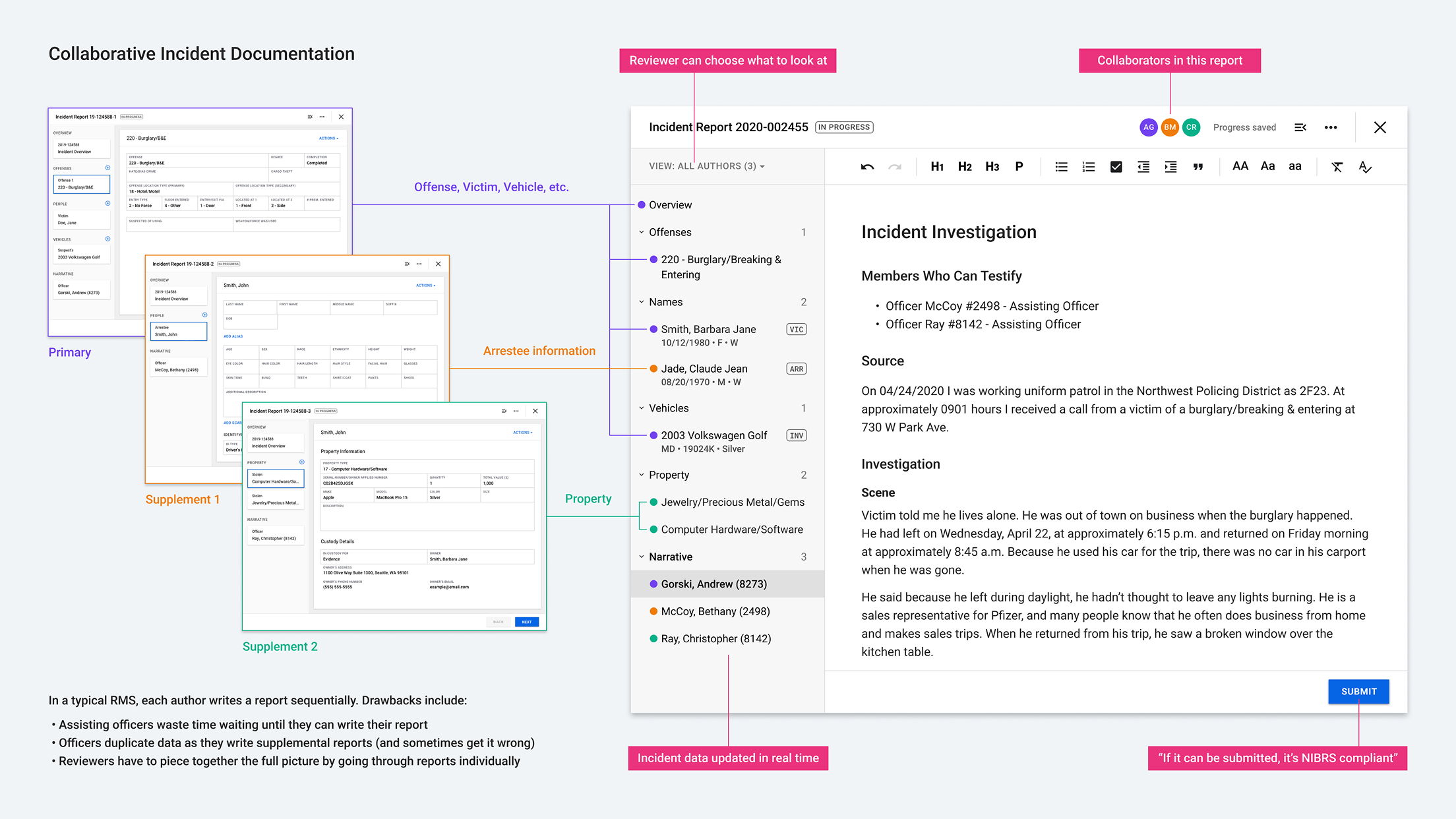
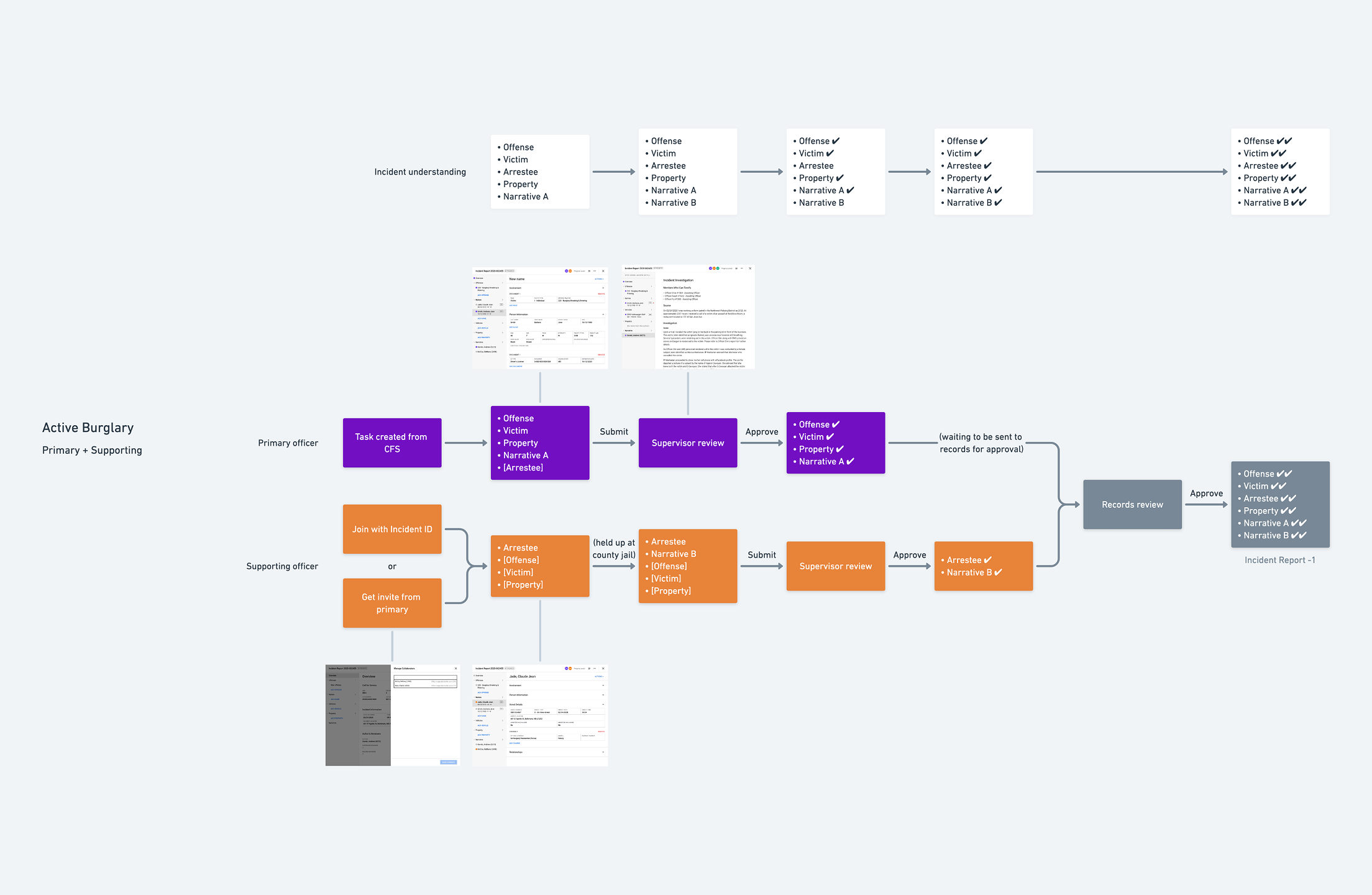
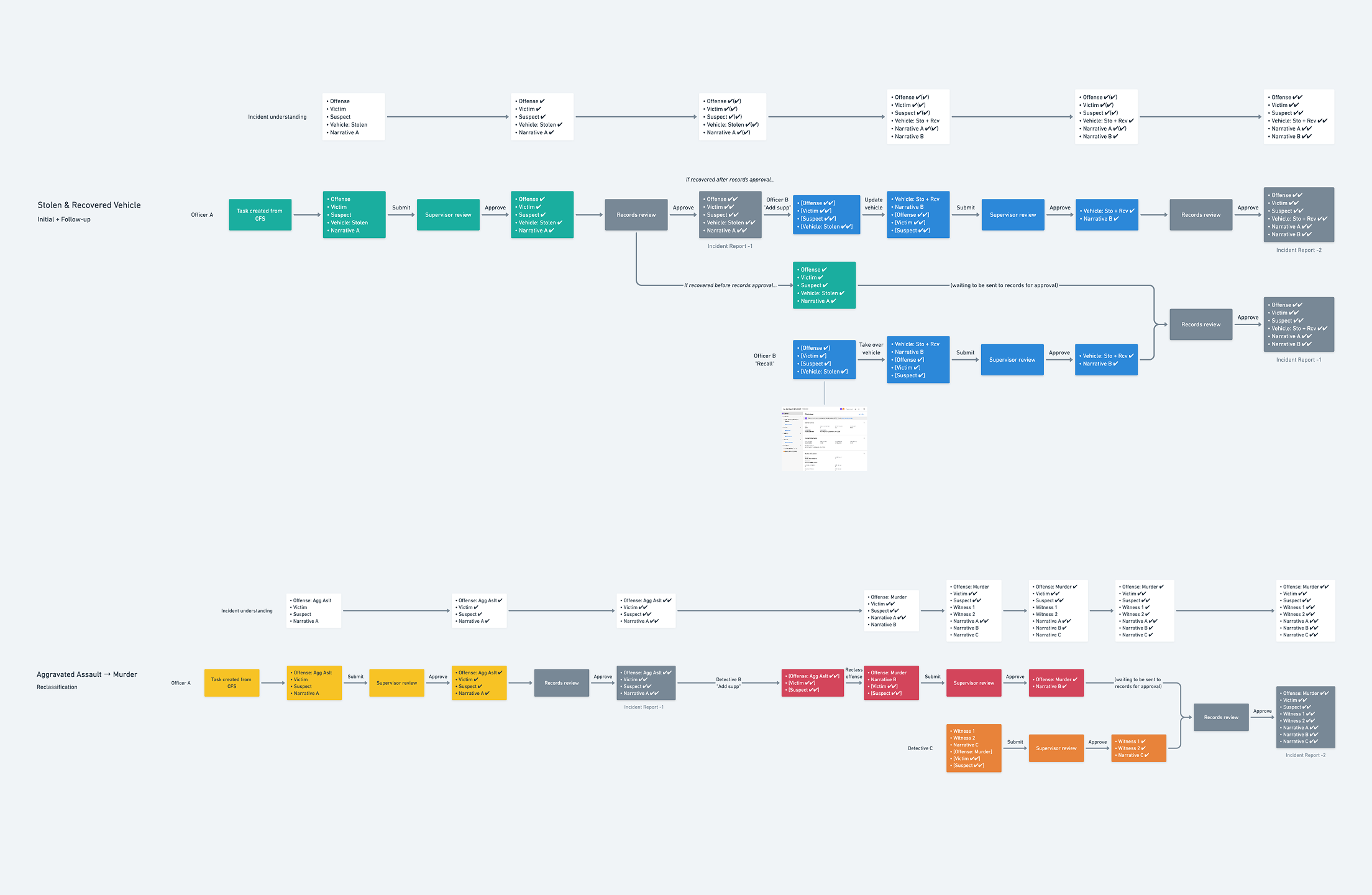
Real-time collaboration
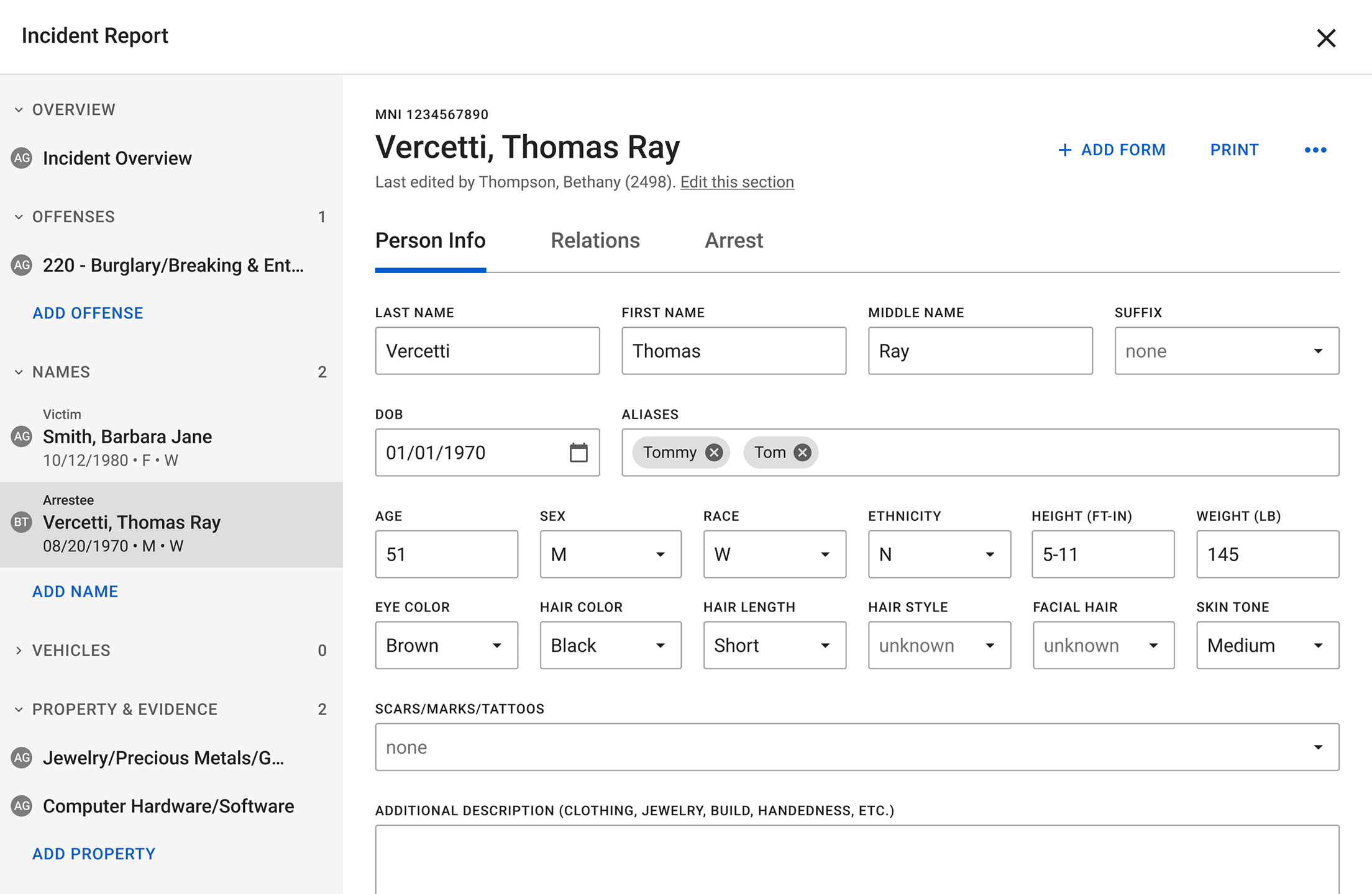
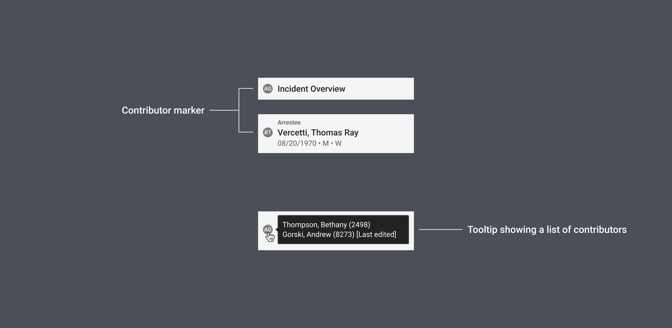
When multiple officers respond to the same incident, they often divide the tasks among themselves, such as interviewing witnesses, cataloging lost property, and booking an arrestee. Each officer then needs to document their contributions.
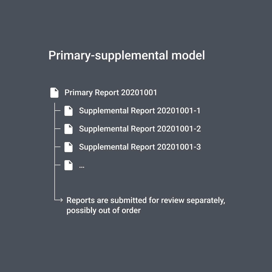
Traditionally, this is done through a primary report and several supplemental reports. This approach creates a bottleneck because supporting officers have to wait for the primary officer to start. It also presents a challenge for reviewers who must sift through (sometimes conflicting) information from multiple sources to get the full picture of an incident.
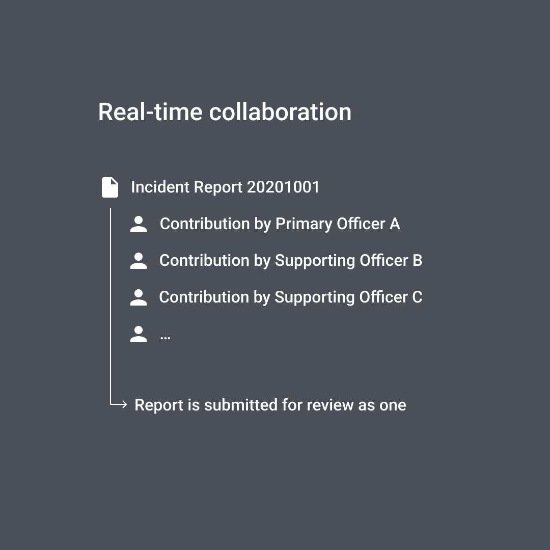
In contrast, real-time collaboration allows officers to work on the same incident report simultaneously, similar to how Google Docs works. It maintains a single source of truth that everyone can contribute to or modify at any time. It also gives reviewers a complete view of an incident without duplicative information.
Project artifacts